
UI/UX Designer
Charu Arora
Hi, I'm Charu!
I'm a designer based in Sweden with a strong passion for creating intuitive digital products and meaningful experiences. I am enthusiastic about crafting visually engaging, user-focused designs that drive business objectives. My philosophy revolves around continuous learning, fostering creativity, and thinking beyond the norm.
UI/UX Case study
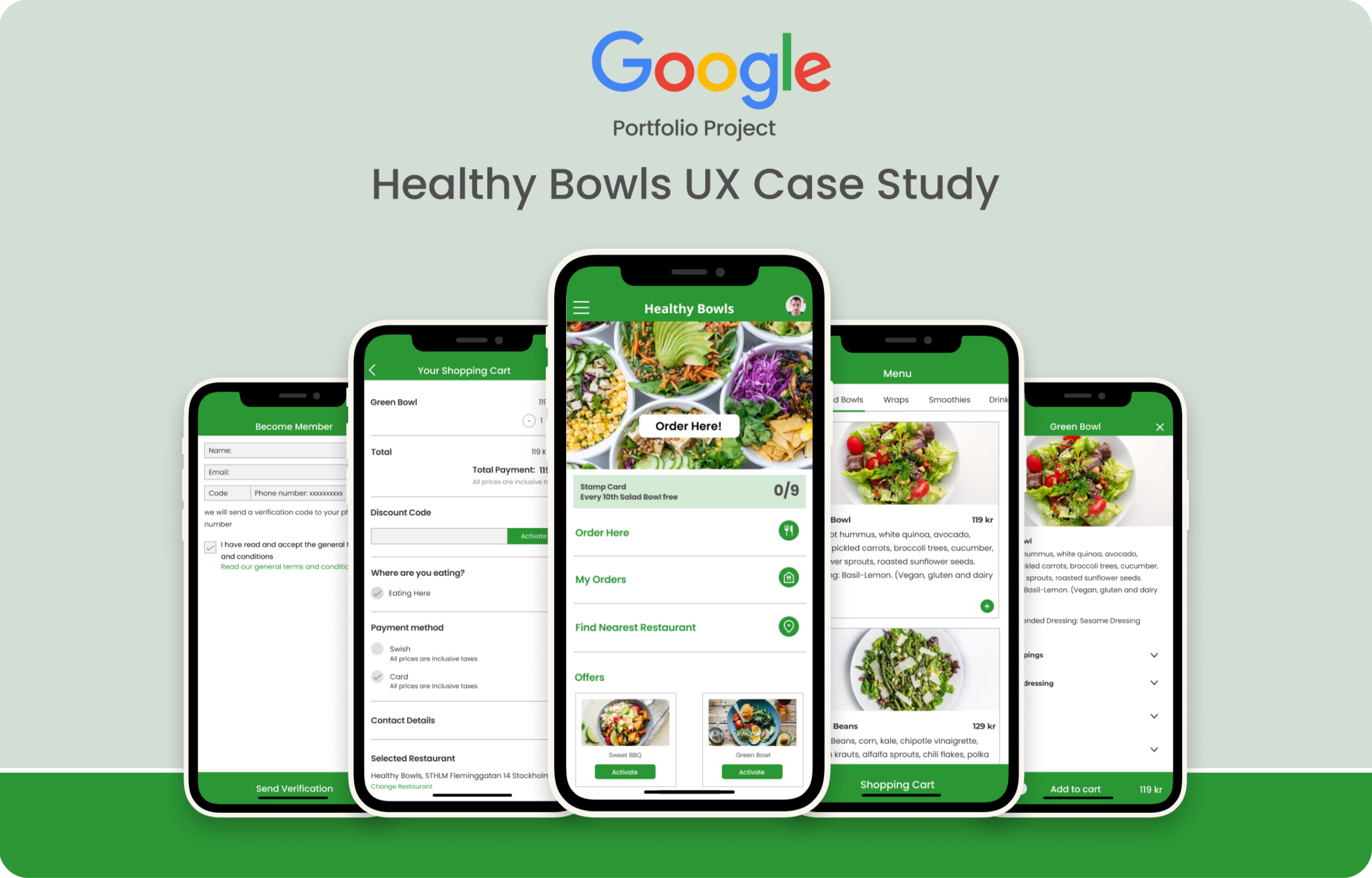
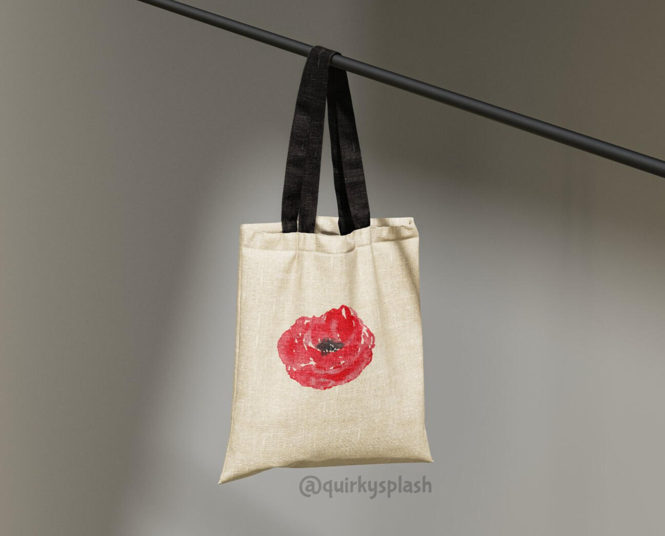
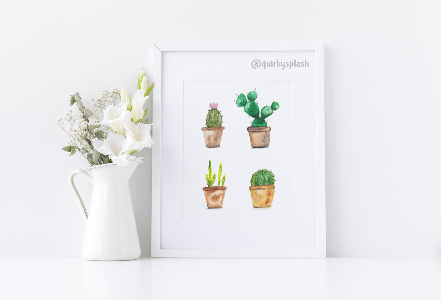
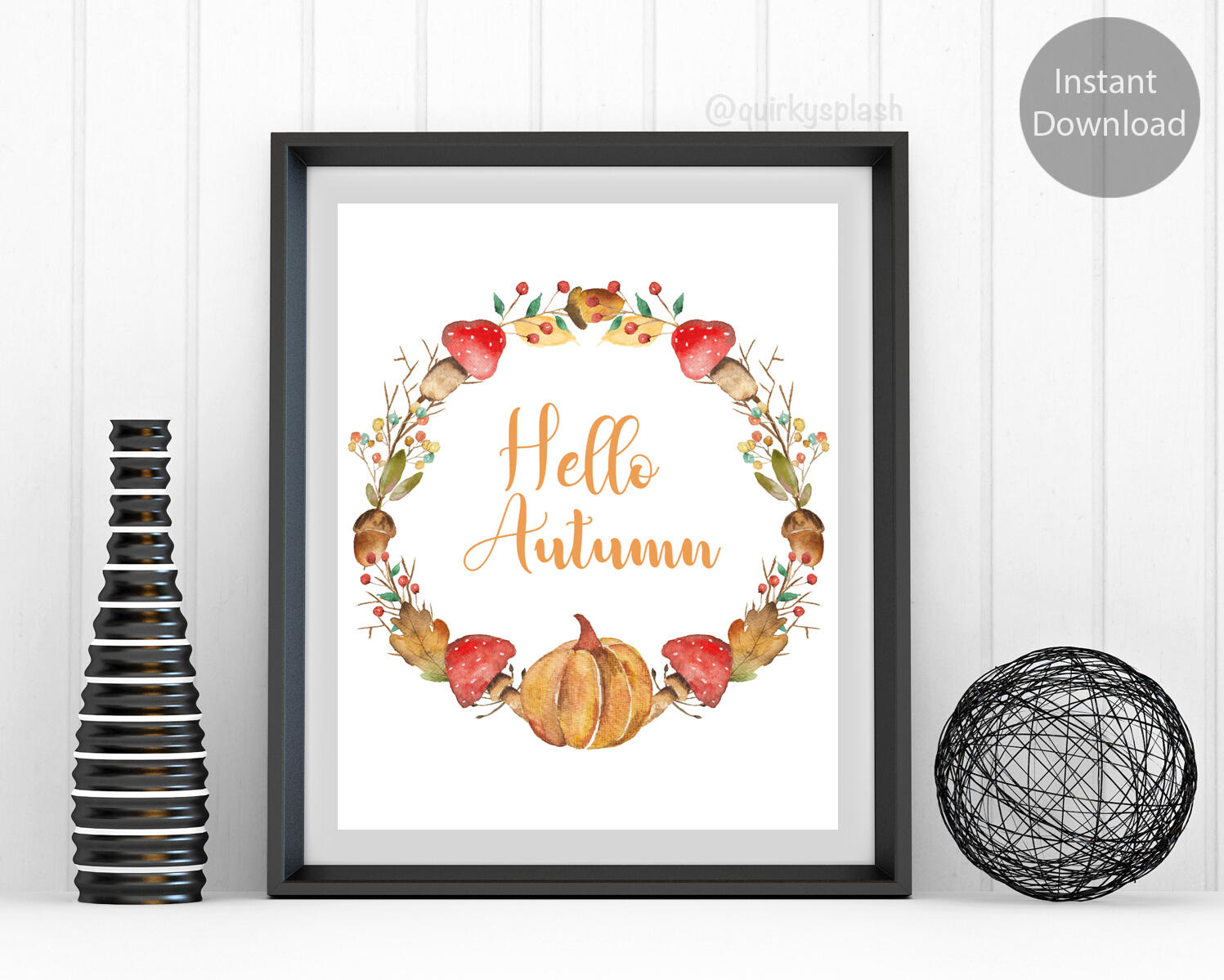
Healthy Bowls
In the hustle and bustle of today's hectic lifestyle, many individuals find it challenging to find time for homemade meals or traditional restaurant dining.Enter "Healthy Bowls" app that is designed to streamline the process of ordering wholesome and nourishing meals from restaurants with speed and convenience.The case study was developed using the Design Thinking framework.
Design Sprint
Volvo Group
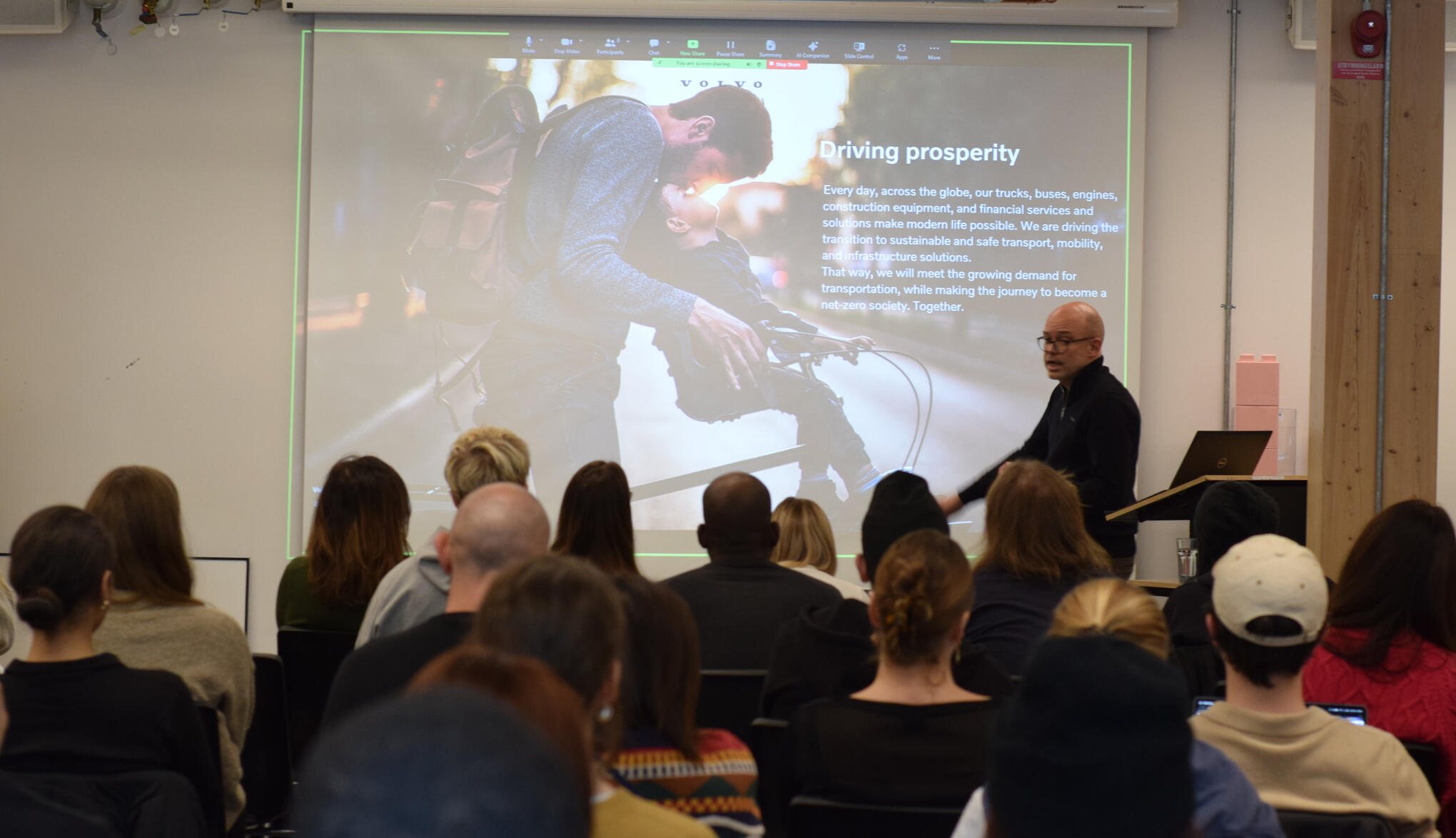
Drawing inspiration from Volvo's commitment to safety-driven AI innovations, the project strives to unite companies in sharing eco-friendly strategies.Our team did a thorough assessment of concepts for Volvo's value and impact and we arrived at our concept of sharing knowledge leveraging AI that will predict maintenance, enhancing safety and lowering future costs.
Branding
1000 Ocean
Our client, 1000 Ocean Startups, represents a collaborative alliance focused on accelerating ocean innovation by uniting various organizations. Serving as a nexus, they connect startups with prospective investors.They tasked us with the challenge of enhancing their existing platforms, making them more prominent among their members and competitors.
Mobile App - UI/UX
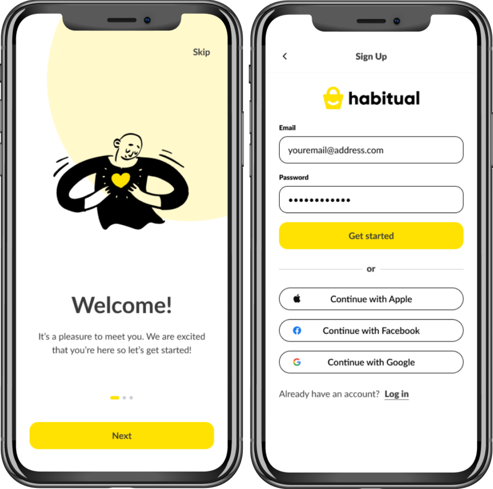
Habitual
This e-commerce app aims to enhance user shopping with a smooth and enjoyable experience. This app was designed to streamline the process of adding products to the shopping basket and minimizing the number of clicks.Dedicated attention was placed on optimizing key features such as search functionality, personalized recommendations, and the display of related products.
UX Design
scandic hotels
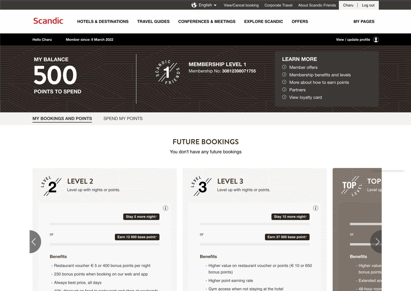
Revamping loyalty program for millions of Scandic members was a captivating journey. Understanding their unique expectations from the existing program, we aimed not just for change but a positive transformation. Our focus was on ensuring a seamless and genuinely enriching transition for each member.
Mobile App and storytelling
Parent
Unity

Imagine a platform that brings together the resilience and strength of single parents, combining their unique experiences, talents, and needs. This platform isn't just about matching profiles, it's about creating a community where bonds are forged, burdens are shared, and opportunities are seized.
Healthy Bowls
Project Overview
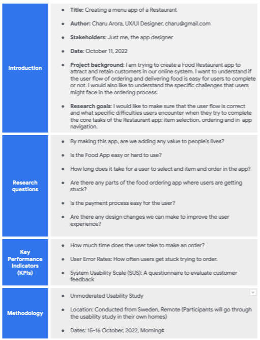
This case study outlines my development approach for a hypothetical restaurant's food delivery app, from concept to final design.Healthy Bowl is an app that aims to help busy and working people who don't have time to cook for themselves and their family and would like to order healthy and nutritional meal from a restaurant quickly and easily. Before releasing the app, I need to be aware of any issues customers might have with the ordering, payment, and delivery processes and figure out how to help them resolve those issues.
Problem we're solving
People struggle to find the time to prepare meals at home among the chaos of today's fast-paced society. Some individuals simply lack the time to eat at a restaurant. Finding a method for these people to order and get food at their convenience was the problem.
The Goals
1. My goal was to design a mobile app that lets users order their meals quickly and easily from Healthy Bowls.
2. This will help restaurants reach out to a wider market.
3. It will also contribute to improve the cashless economy system.
My role
User research, UI design, wireframing, prototyping, usability testing, writing the user experience (UX), iterating, and producing the final high-fidelity prototype were all tasks that were under my purview.
All of the knowledge I gained from the Google UX design professional certificate programme was put to use.
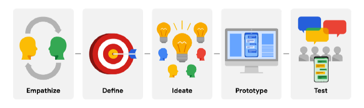
My Design Process
For this project, I went with the lean UX Design framework.
Understanding the User - User Research
The best way to truly understand the needs and motivations of the people I’m designing for is by hearing from them. I interviewed 5 working adults aged between 18 and 62 years, who have some experience with ordering food online.From the user interviews, I was able to build Empathy Maps, User Personas, and Pain Points based on my two focus groups. After synthesizing this data I moved onto devising Problem and Hypothesis Statements. I delved into secondary research with a Competitive Audit, and used this information for the brainstorming activities of “Crazy Eights” and “How Might We’s”.
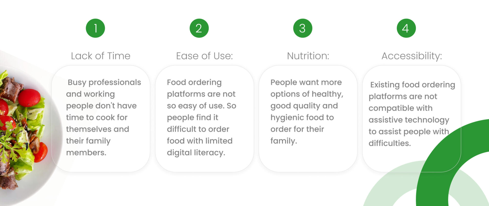
User's Pain Points
Identifying and addressing user pain points is an excellent way to begin to see some of the frustrations a user might have when navigating or operating a product or interface. I identified and categorized user pain points into 4 sections.
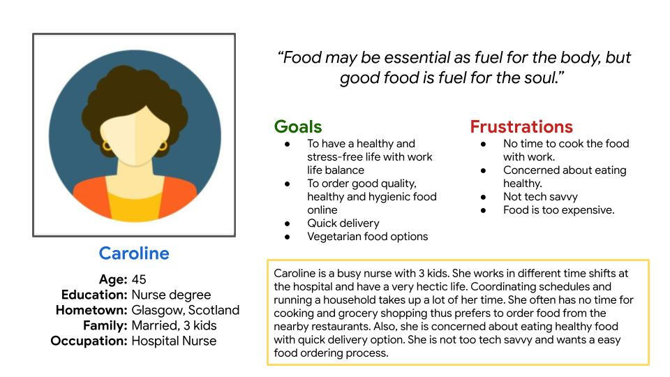
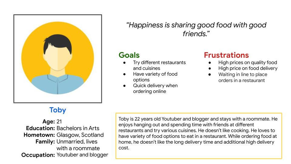
User Personas
I found two user groups; one which comprises people who have a busy daily routine & want to order healthy food frequently. And another which comprises youngsters and students who enjoy going out more often.Now let’s give them names! We’ll call the first user group Caroline, who is a busy working mom; and the second user group Toby, who is a Youtuber and Blogger. Find more about them in the personas and journey maps I made for them.
Problem statement and Hypothesis
Identifying the problems that users face is one of the most important parts of UX design. It is imperative to have a problem-solution fit. We ensured that by starting with clear problem statements for our primary personas. We used “who, what, when, where, why, and how” to create these statements. Then we created the hypothesis for the potential user experience. We’d later test that in usability testing.
User Journey Map
Caroline’s user journey map demonstrates how the situation of ordering healthy food from an app would make her life easier.
Competitive Analysis
Competitive audits are one of the many valuable steps you can take during the ideation process. I analysed the major direct and indirect competitors to the food app concept to get a true sense of what the user’s pain points are.
How Might We
After knowing the service provided by the indirect and direct competitors, I started learning how to address the gaps and users’ pain points and how it can be implemented in the best manner.
How might we display the details of the meals?
How might we make the payment process easier?
How might we make the ordering process faster?
How might we ease the process of looking for a specific meal?
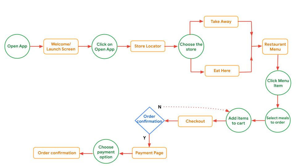
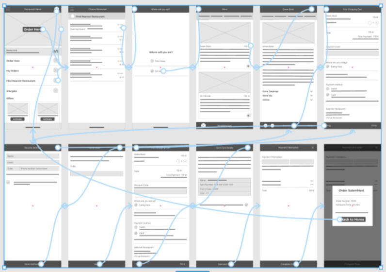
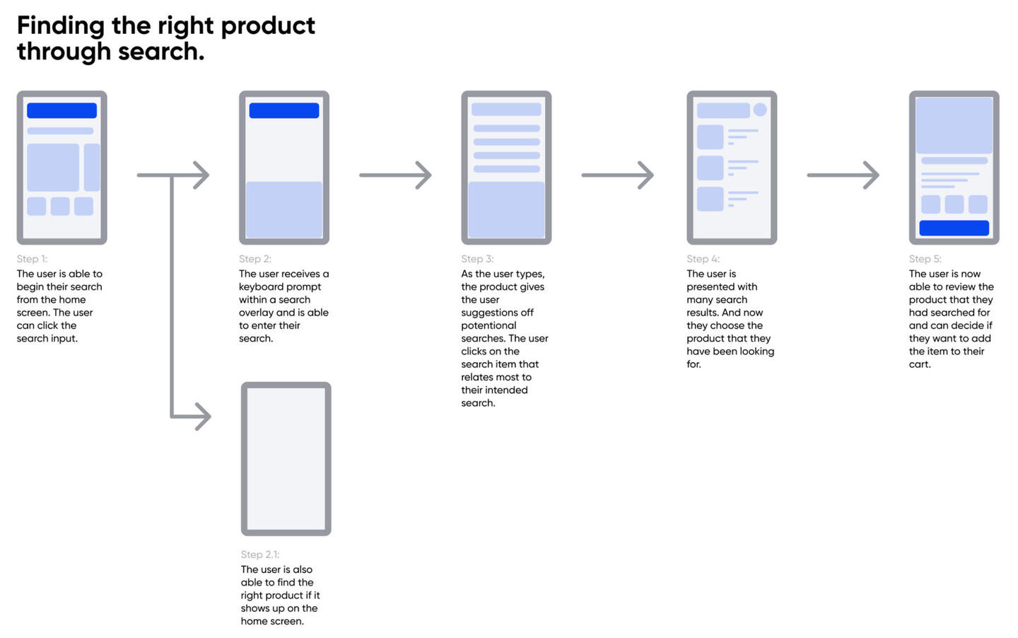
User Flow
Here is the main User Flow which I Created to helped me make a checklist of all the pages to be designed (represented by orange).
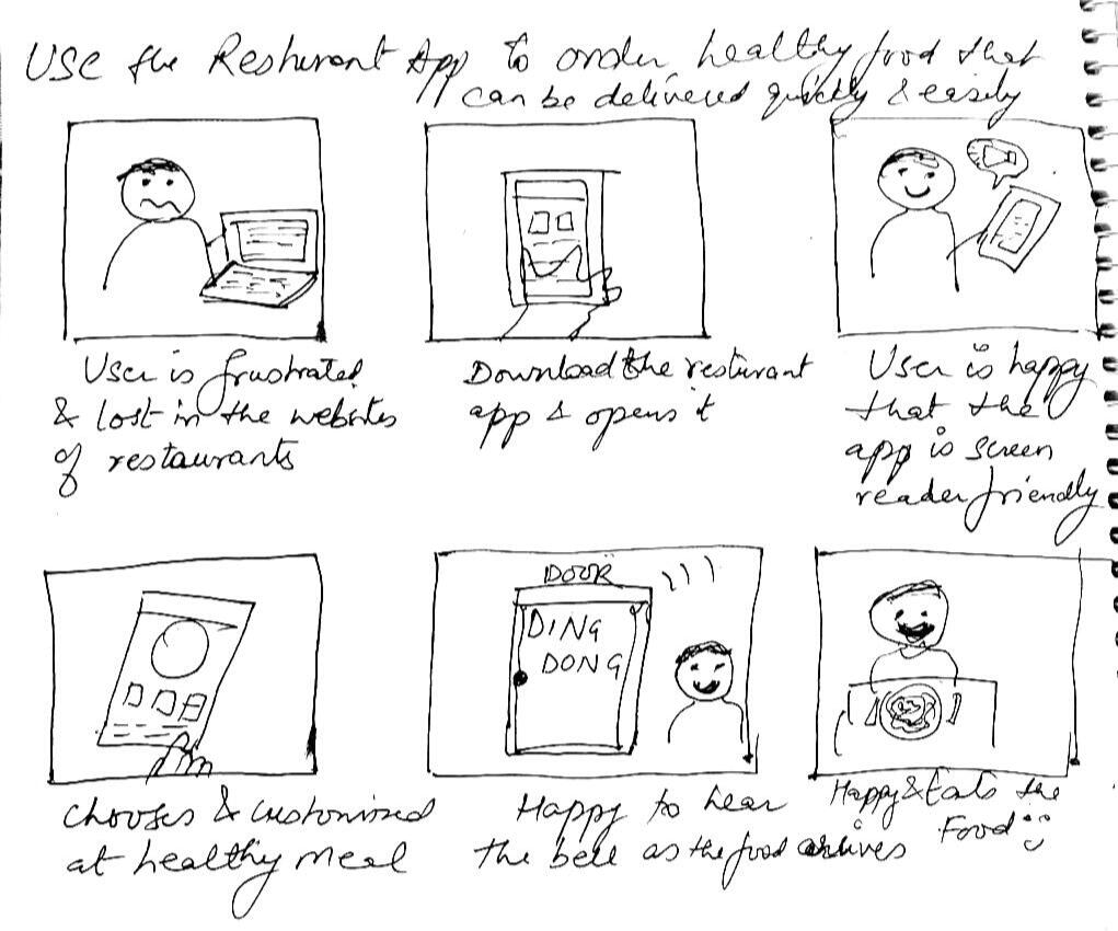
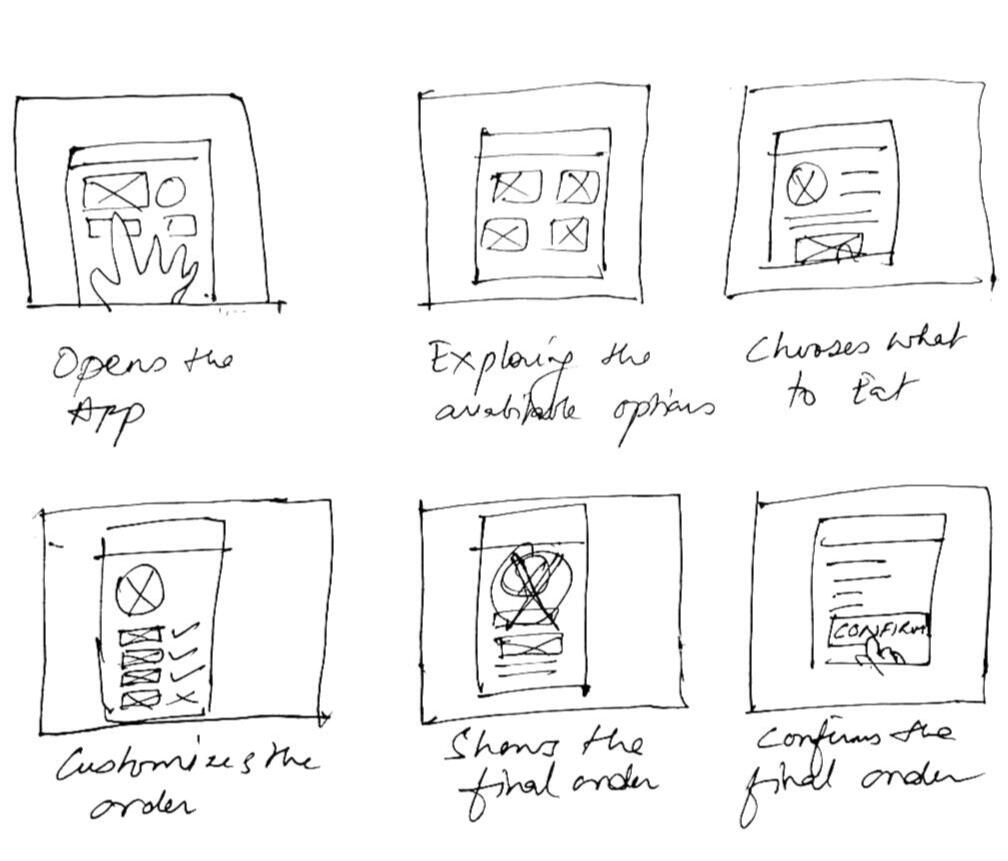
Story Boards
Storyboard is a series of panels or frames that visually describes and explores a user’s experience with a product.
To further empathise with users and see a bigger picture of the process I created many big-picture storyboards. Each storyboard represented a major user-flow. To further drill into their product experiences I made close-up storyboards as well.
Big picture Story Board
Close-up Story Board
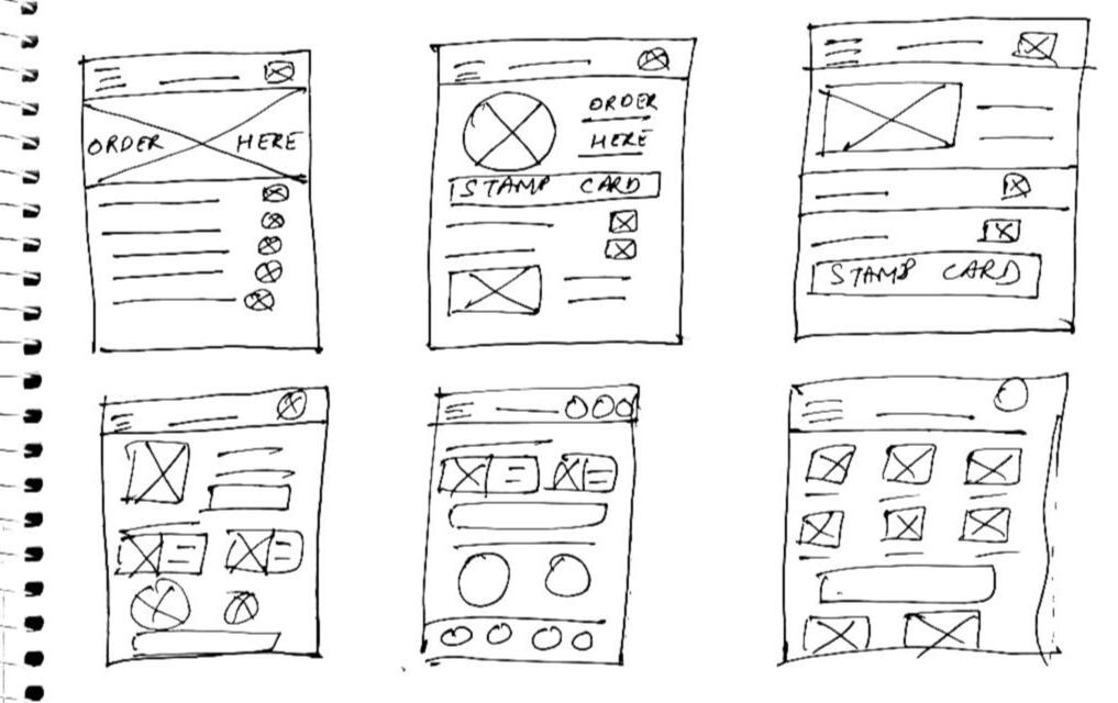
Paper Wireframes
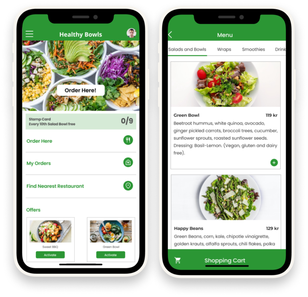
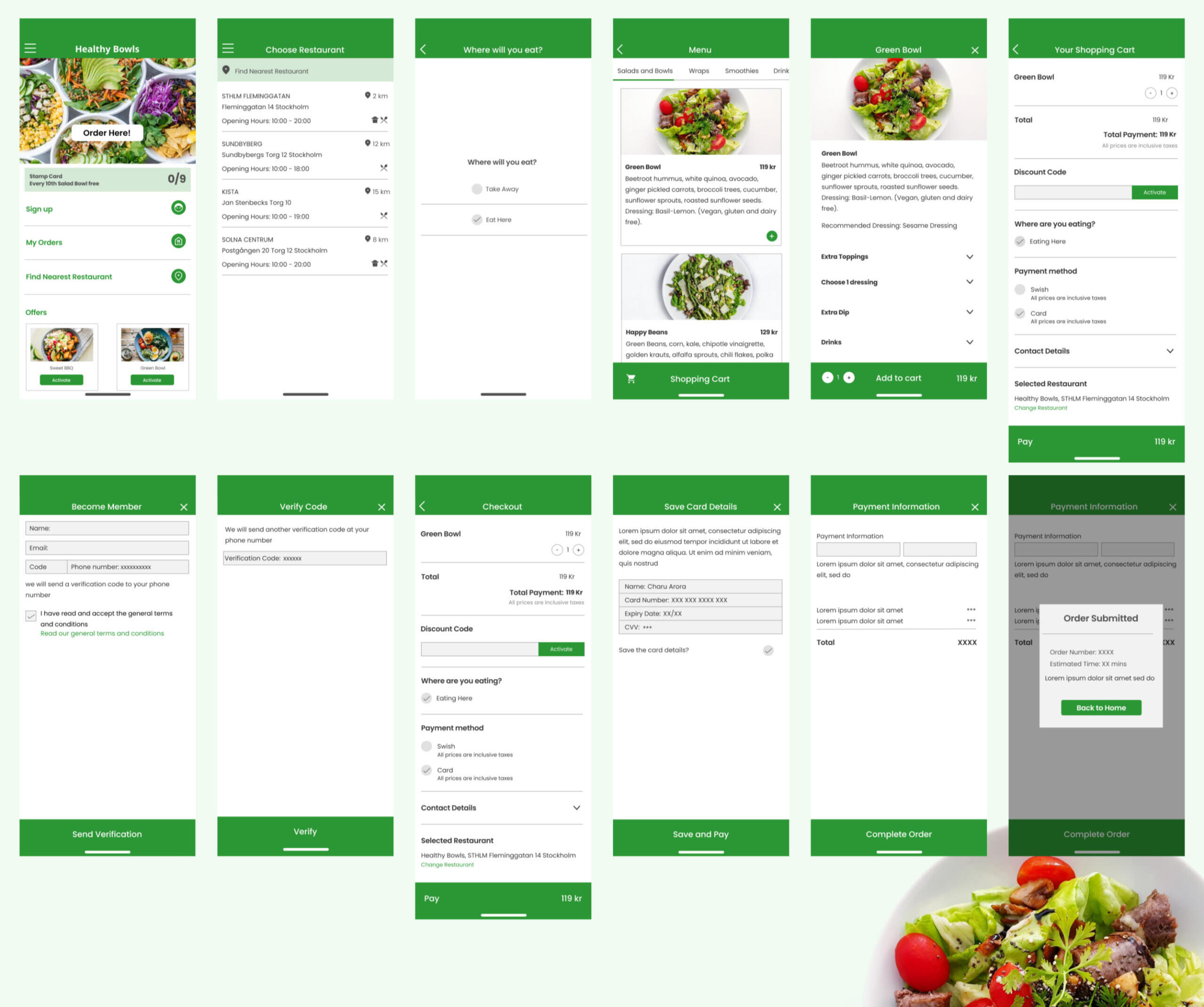
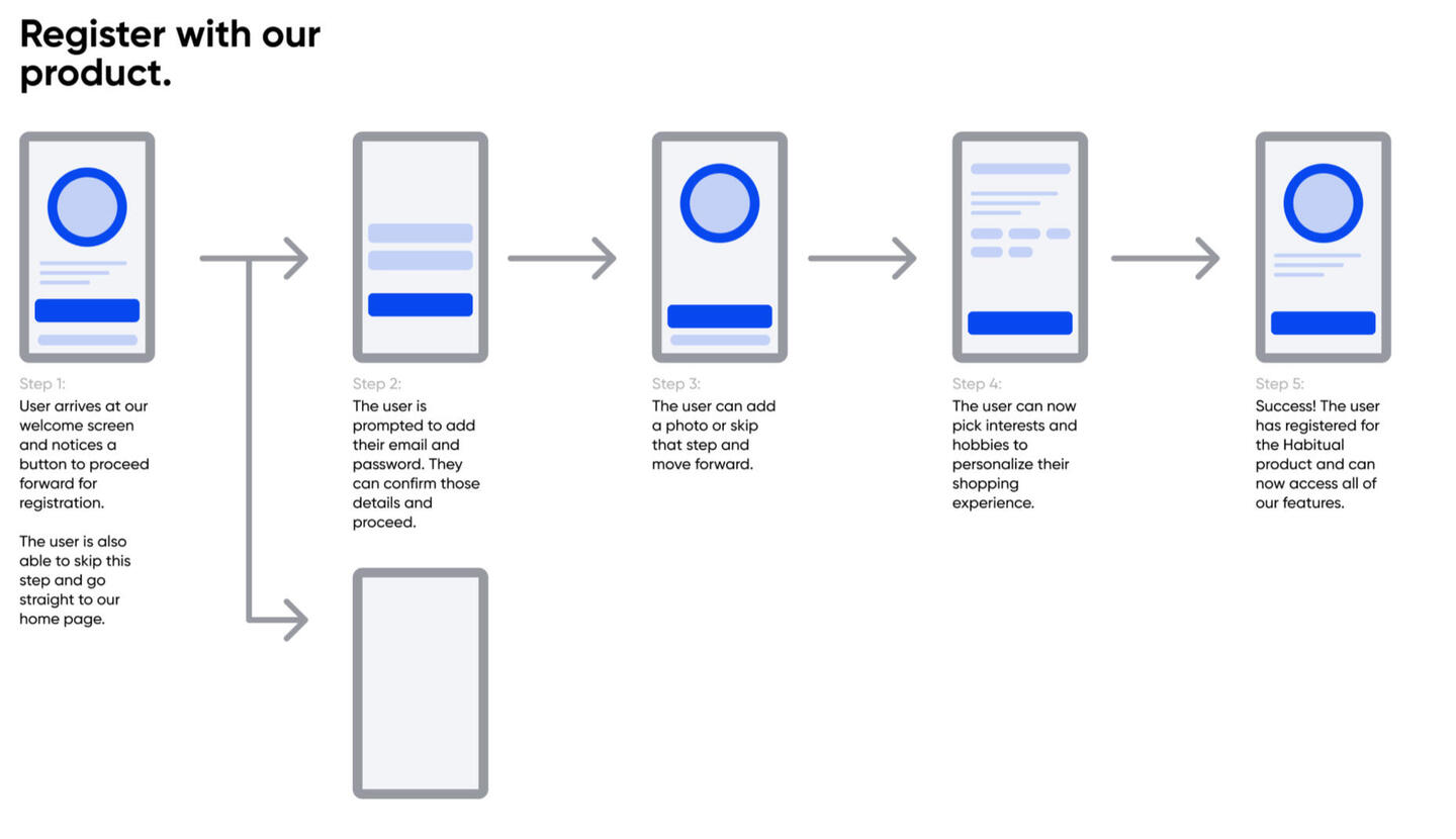
After mapping out the user flow, I started drawing wireframes. To make sure that the components that made it to the digital wireframes adequately addressed the user pain points, several iterations of each screen were created on paper.For the home screen, I prioritized ease of use and a quick ordering process, to make the experience smooth and stress-free for the users.
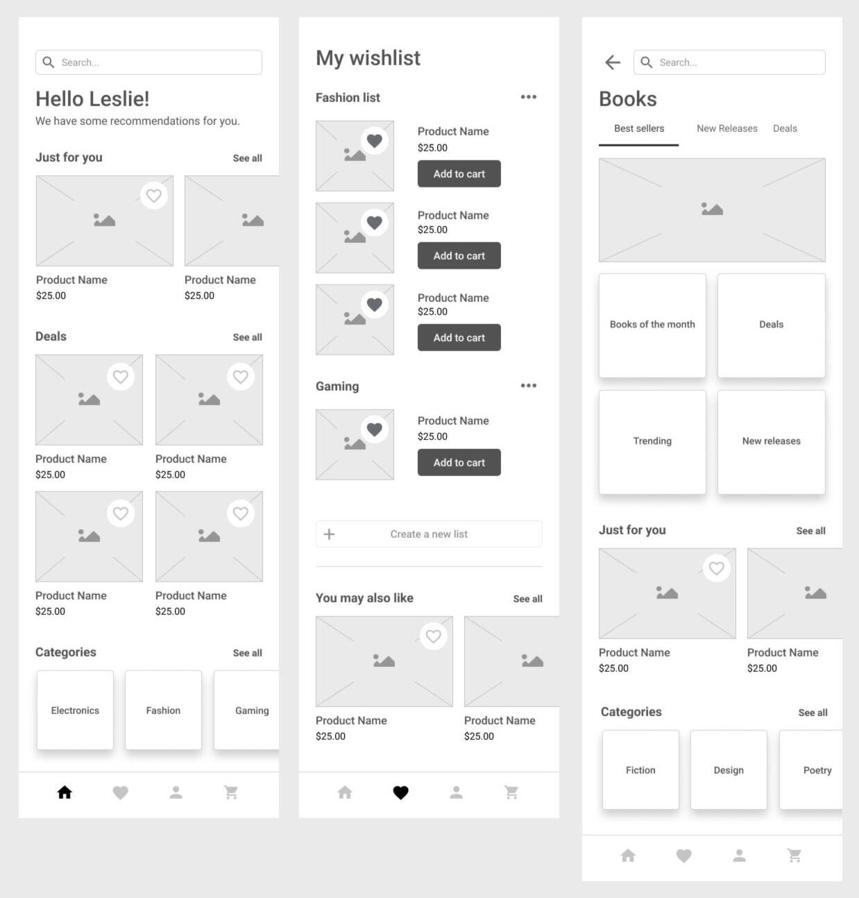
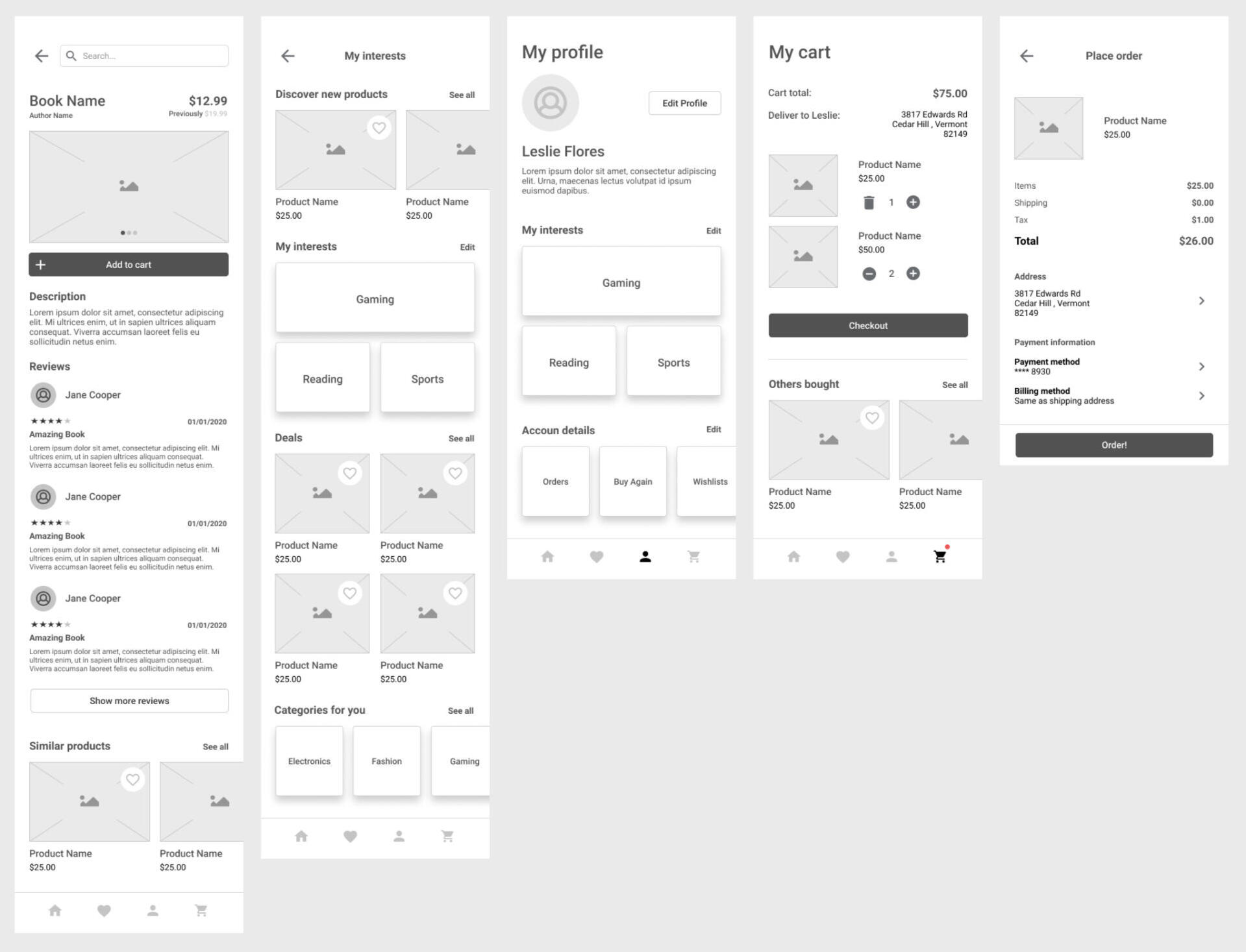
Digital wireframes
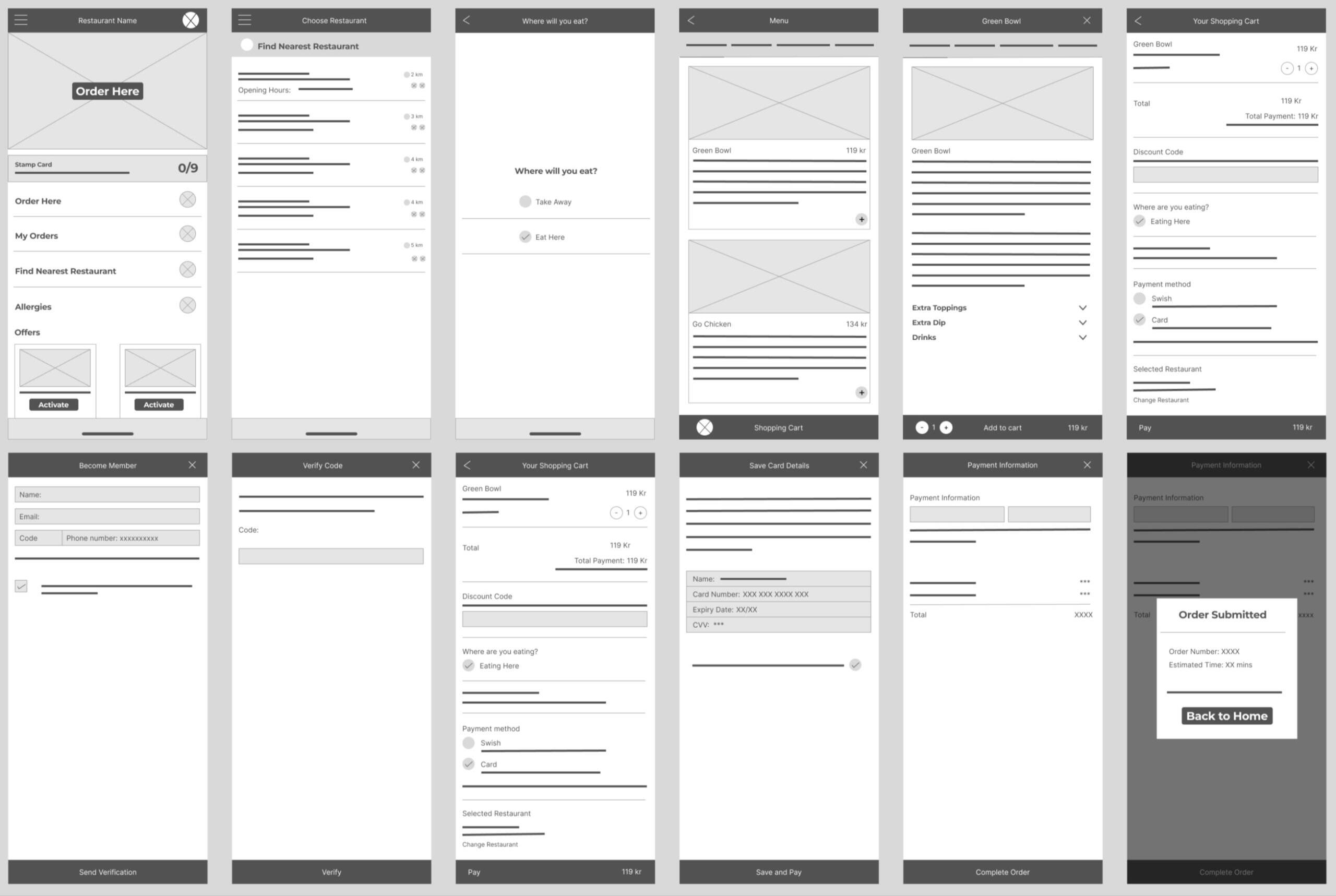
Prototype Screens
Usability testing
I conducted a unmoderated usability testing with 5 participants where users were asked to perform specific tasks in a low fidelity prototype.Few Research Questions:
How long does it take for a user to choose and order their meals on the app?
Are users successfully able to order the food item of their choice?
What can be learnt from the steps a user takes to complete the order process?
Are there any parts where the users are getting stuck?
Is the payment process easy and intuitive for the customer?
Affinity maps
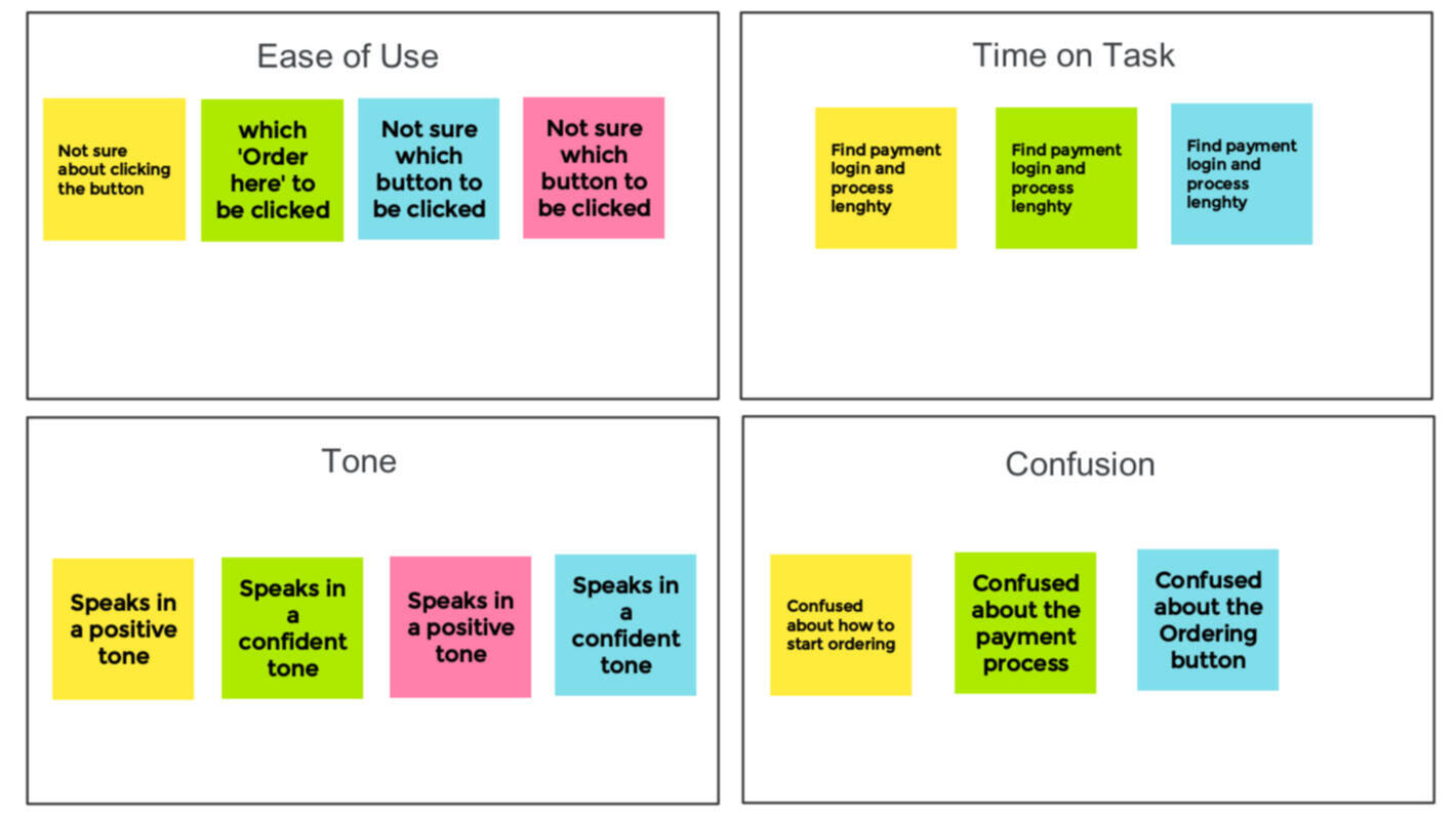
Refining the design
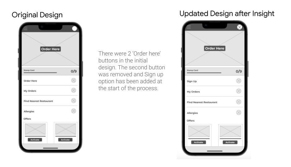
Based on the results of usability testing, I was able to identify problem areas in the app’s design and made changes to the homescreen 'Order here' button. Most participants were not sure of which ‘order now’ button to click. The results were noted down and an affinity diagram was used to identify patterns.

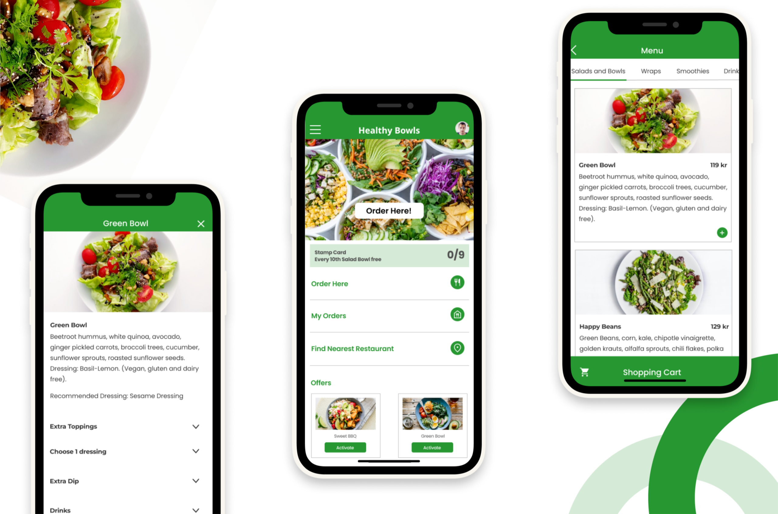
Hi-Fidelity Designs
The following picture shows the final hi-fi prototypes.
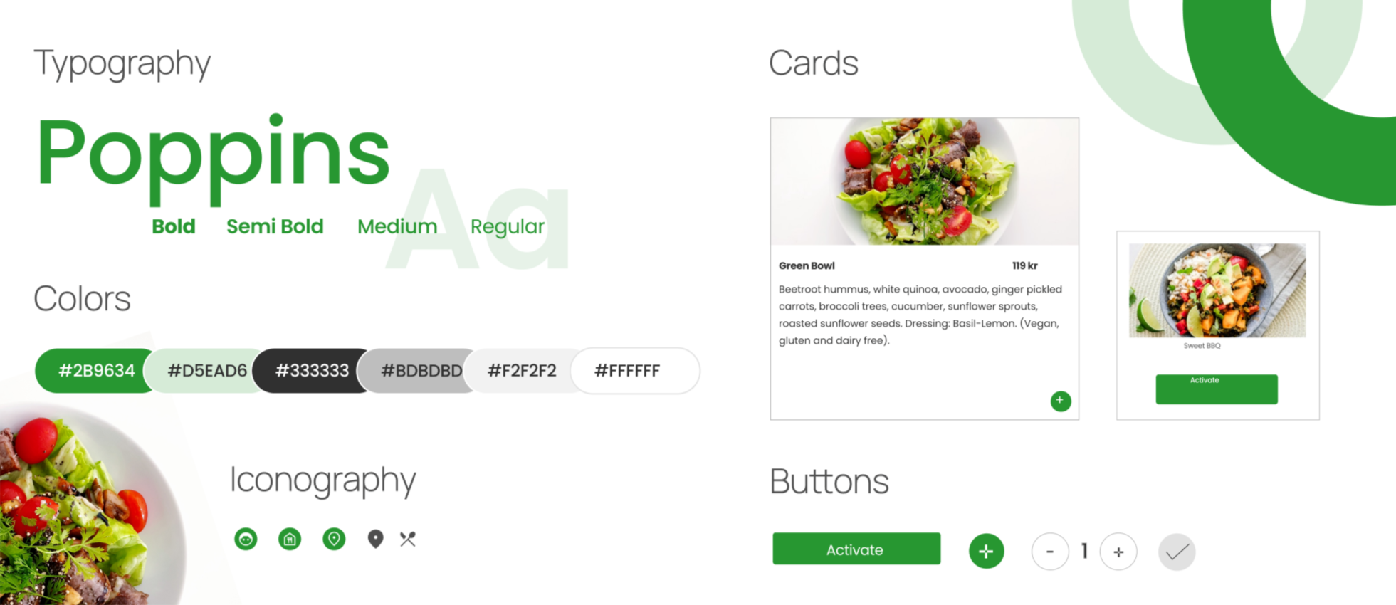
Style Guide
Below is the list of components and elements of design system used in the creation of High-Fidelity Prototype. Finding a balance between aesthetics and meaningful elements in the design is what I like to accomplish. Colors, Fonts, icons, Typography and every pixel plays a important role building emotional relationship with the user.
outcome
Key results
Finally, the research and idea-generation from earlier courses took on actual shapes and colours. Working on this project taught me how important it is to put the user at the forefront of every design stage and to always approach a feature from the user's point of view. There isn't really a step in the process that I would pick over another. The user research and interviews were fascinating, and the UI creativeness was inspiring.What a journey! I have to admit the fact that I persevered and learned so much new information also fills me with a great deal of pride.The certificate is still in progress.I have completed 5 amongst the 7 courses from Google UX Design Professional Certificate.Thanks for scrolling till the end!
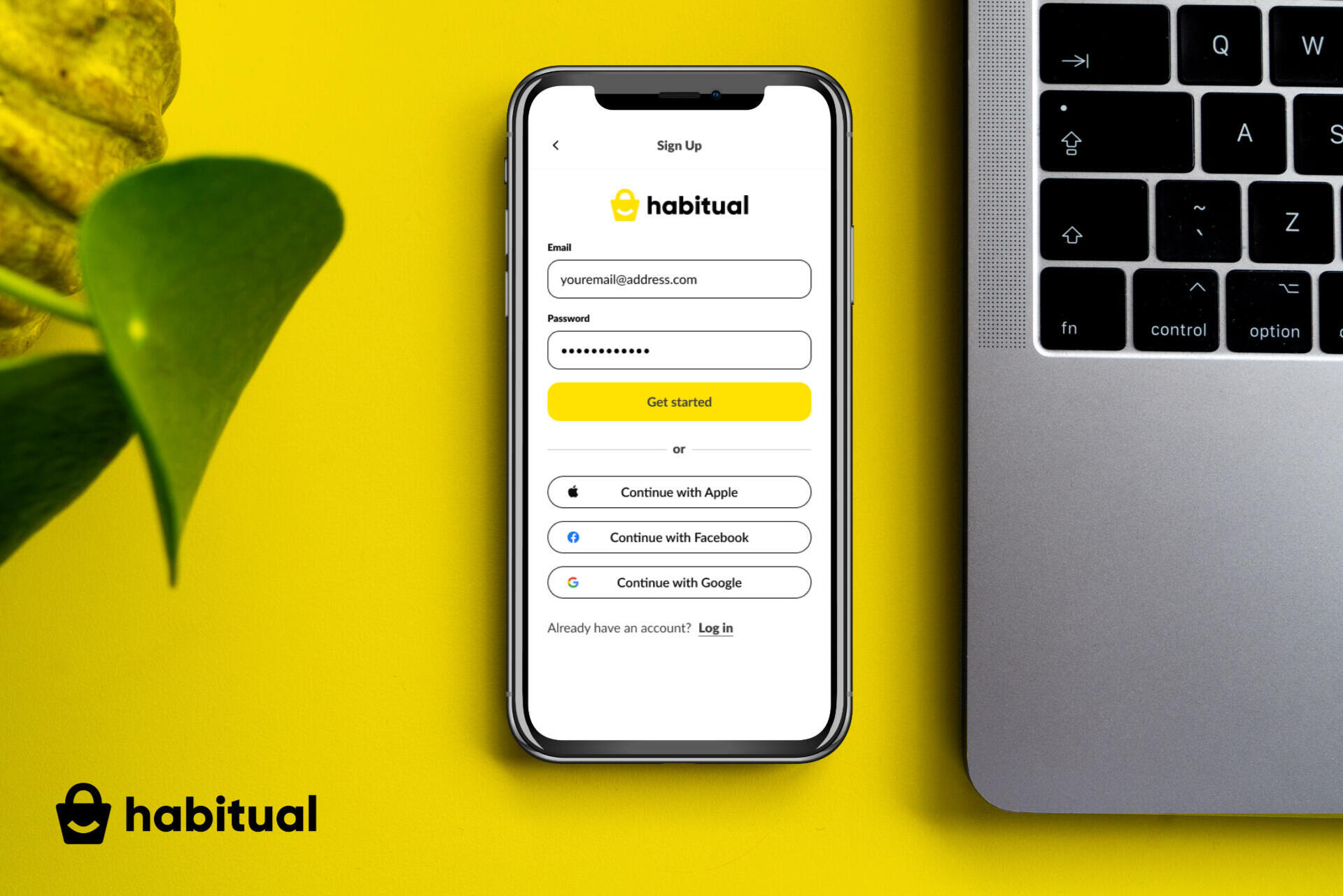
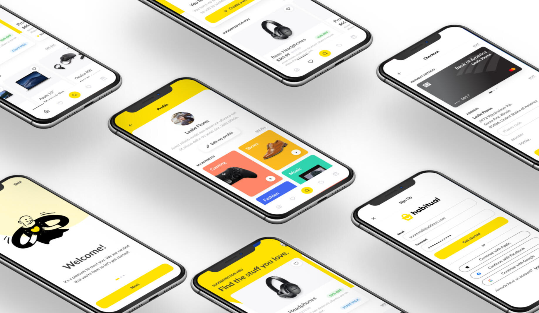
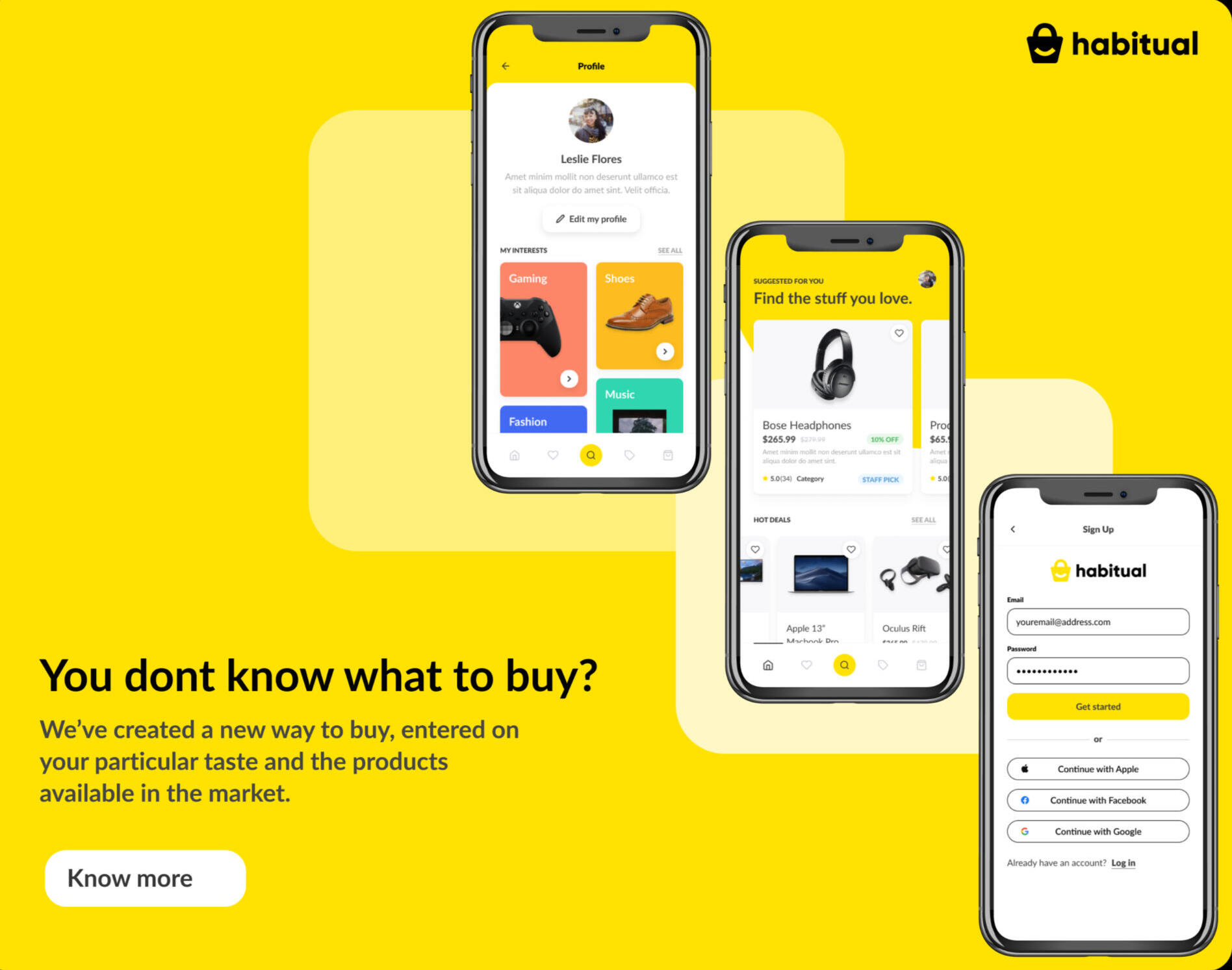
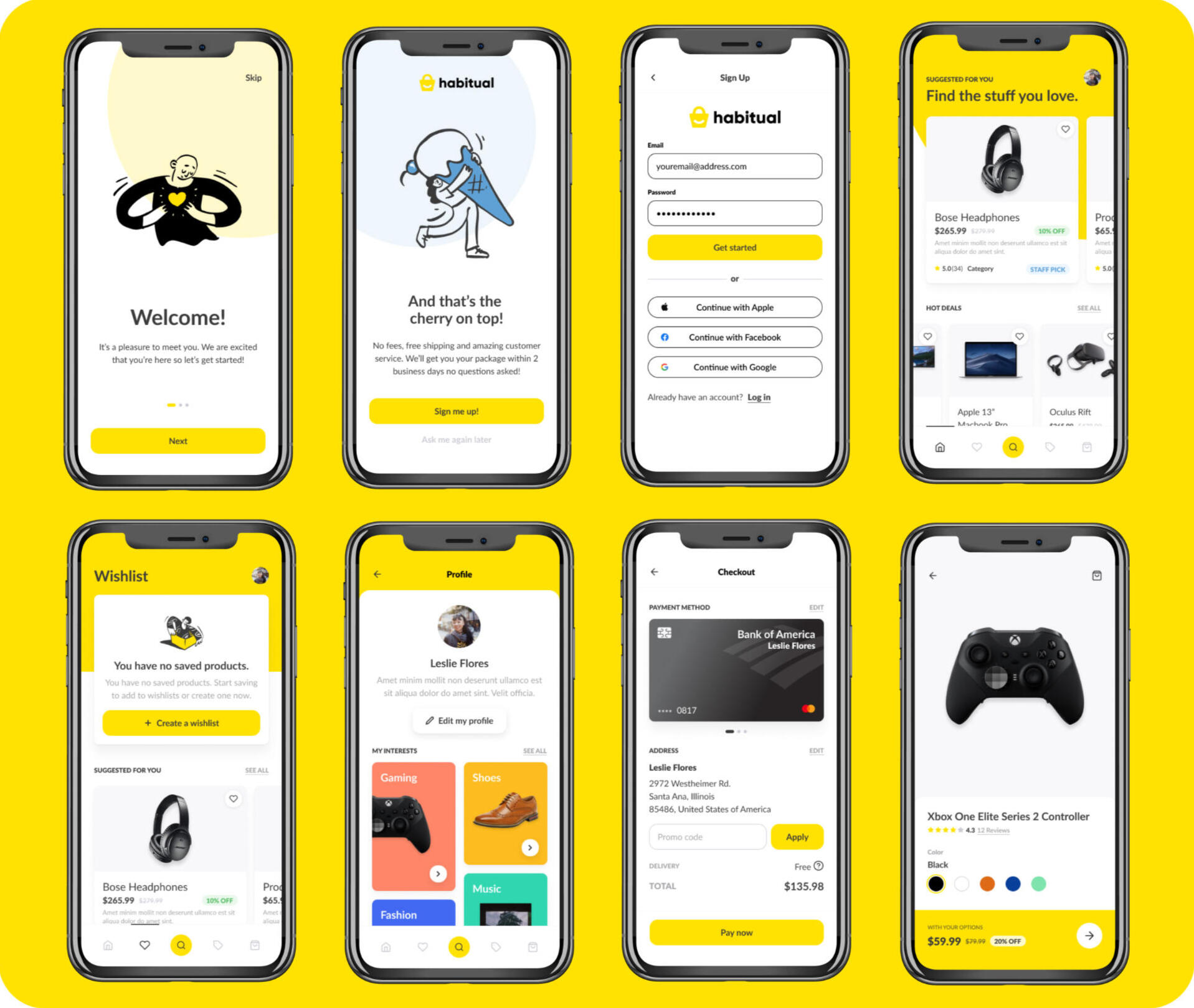
Habitual
This e-commerce app helps the customers of the platform with a smooth shopping experience. The user journeys were defined to help the user add products to shopping basket with minimum clicks before entering into payment flow.Special focus was given to search, recommendations and related products to enrich customer experience but at the same time ensuring not to add a lot of distraction and let the user choose easily.
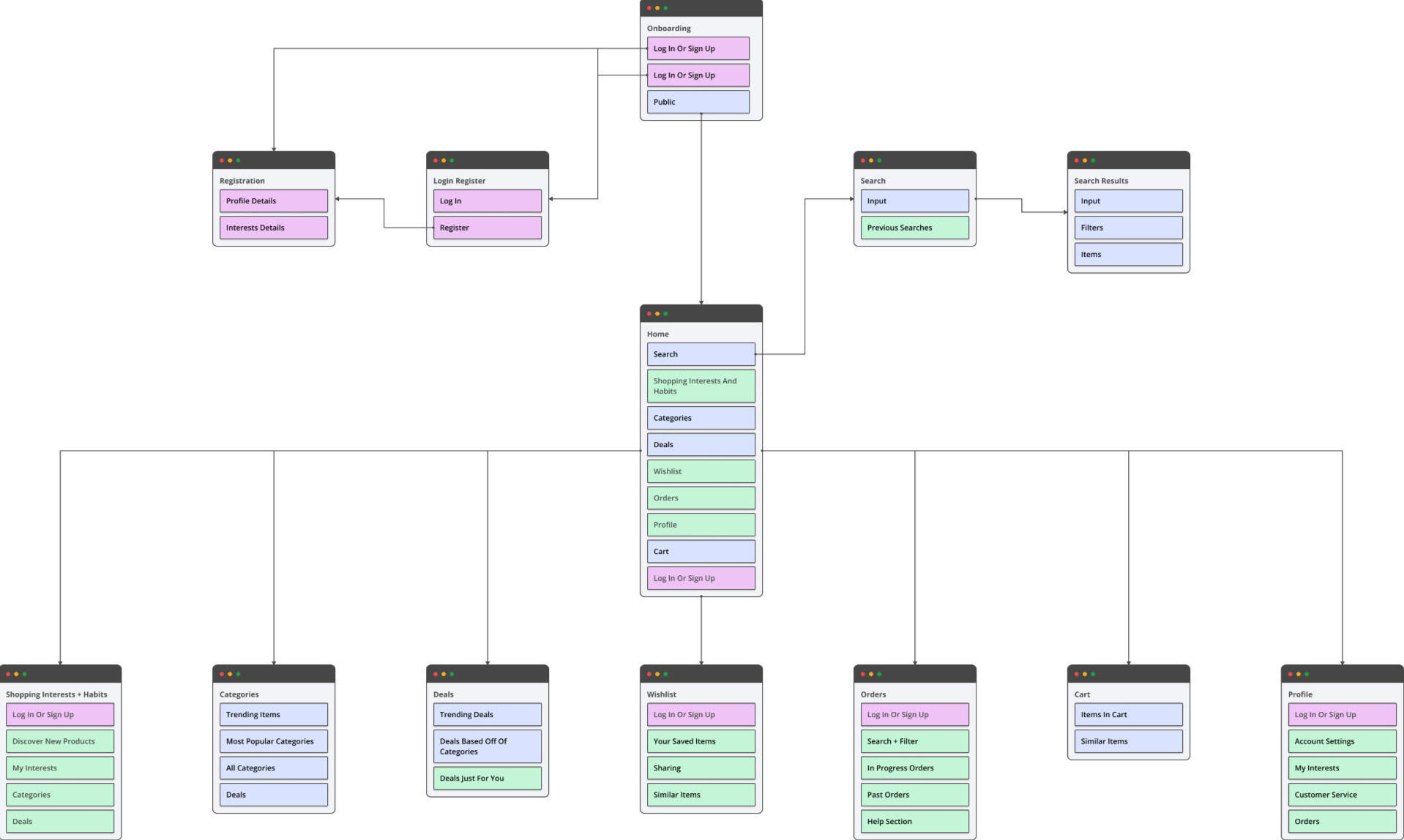
Sitemap
Concepts + User Flows
This concept e-commerce app helps the customers of the platform with a smooth shopping experience. The user journeys were defined to help the user add products to shopping basket with minimum clicks before entering into payment flow.Special focus was given to search, recommendations and related products to enrich customer experience but at the same time ensuring not to add a lot of distraction and let the user choose easily.
Low Fidelity Wireframes
After we defined the flow and thus what screens we needed, I proceeded with creating the wireframes to explore the experience in more detail on a screen-by-screen level. The main focus was the "add to cart/basket" flow which sits at the heart of the app.
logo
Logo is visual identity and face of the company. Habitual logo is a combination of a shape and text that depicts the purpose of business.The colours used are black and yellow. Other combinations that are all black or all yellow or all white are used based on the background colour.
It conveys the brand message in a way that helps to establish an emotional connection with the target audience.
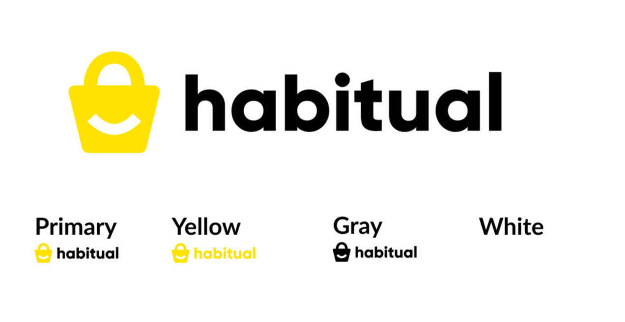
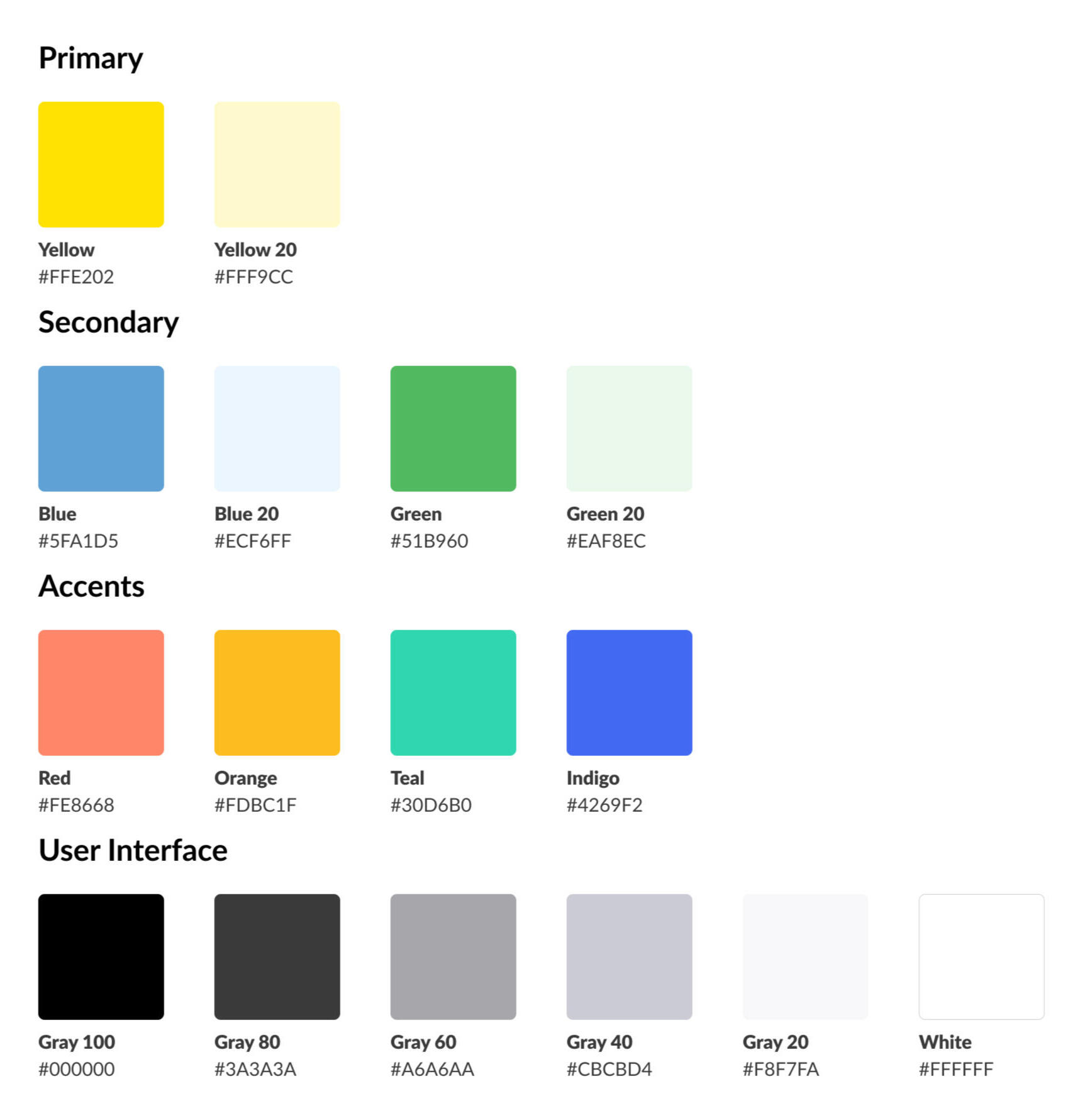
Colors
Color is the easiest and most important aspect of engaging the user with the product in Design.Yellow is the primary colour for the logo and main call to action buttons. Yellow should always be used on white background with black overlay text to avoid contrast issues. Black is used for other call to actions as a fill or stroke. Other colours with the hexa codes are mentioned as well.White colour is sometimes used as a purely aesthetic choice, it is, in fact, a key component of the psychological impact of a design on users.
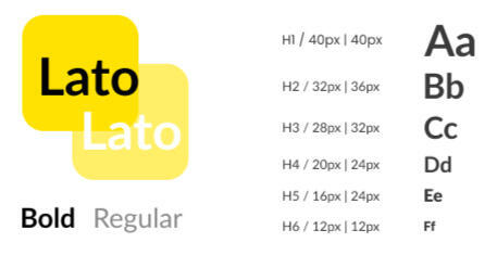
Typography
Typography promotes legibility and helps to communicate the messaging, tone, and sentiment of a design piece.Lato is used for all the headlines and the body text. Every artwork should be done using only this font. Another function of typography revolves around aesthetics. We're drawn to visually attractive designs that are clean and easy on the eyes.
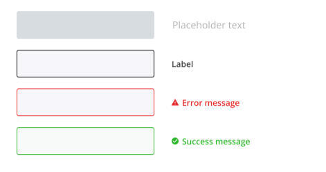
Components
UI elements or user interface elements are the most integral part of a software application, regardless of whether it's a mobile, web, desktop, or Augmented Reality or Virtual Reality app.
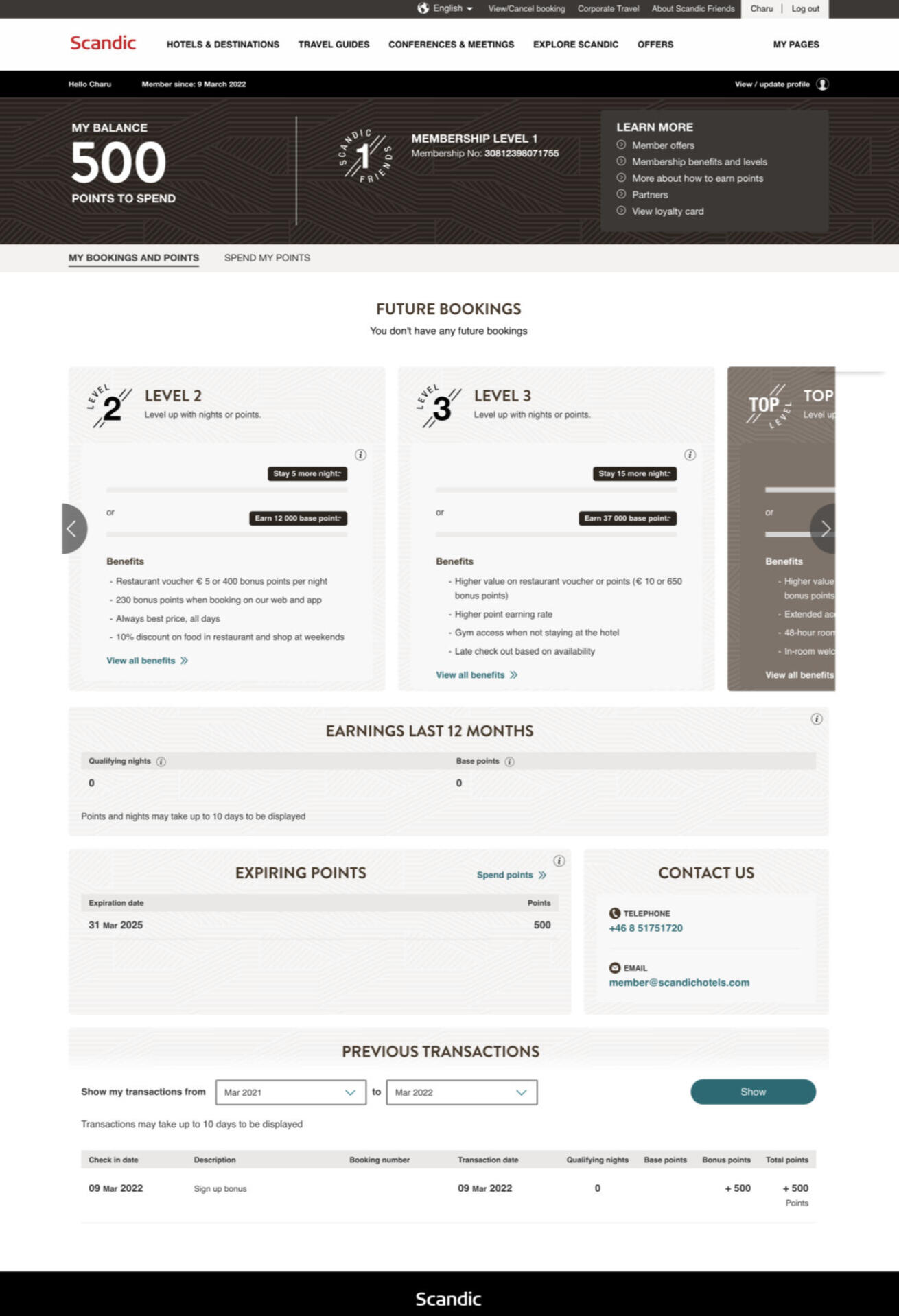
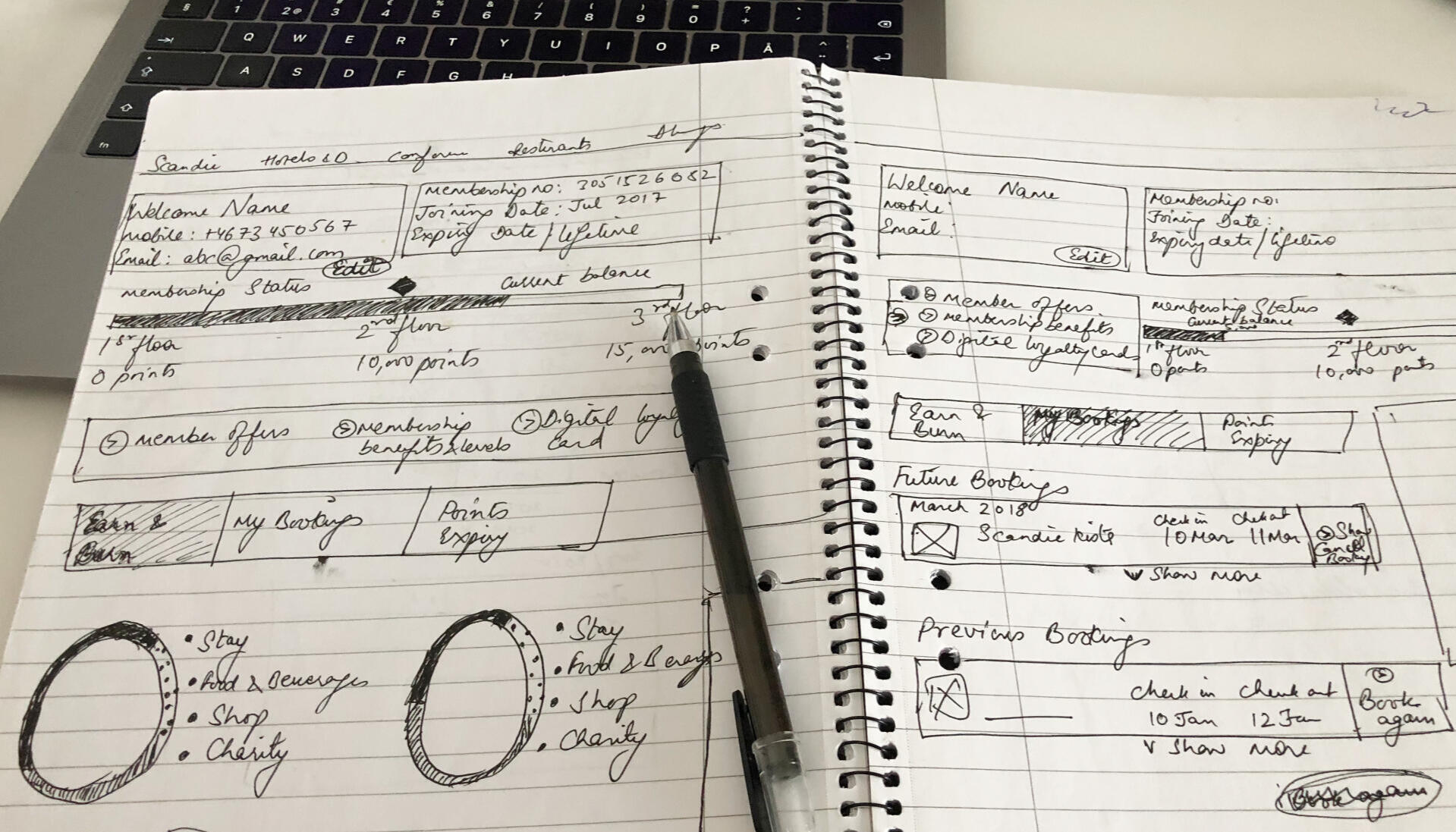
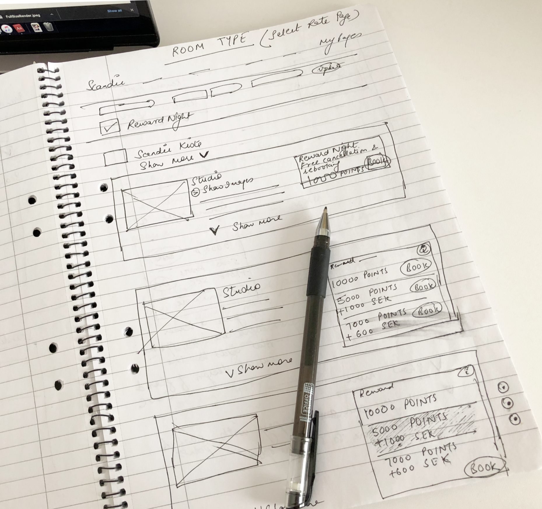
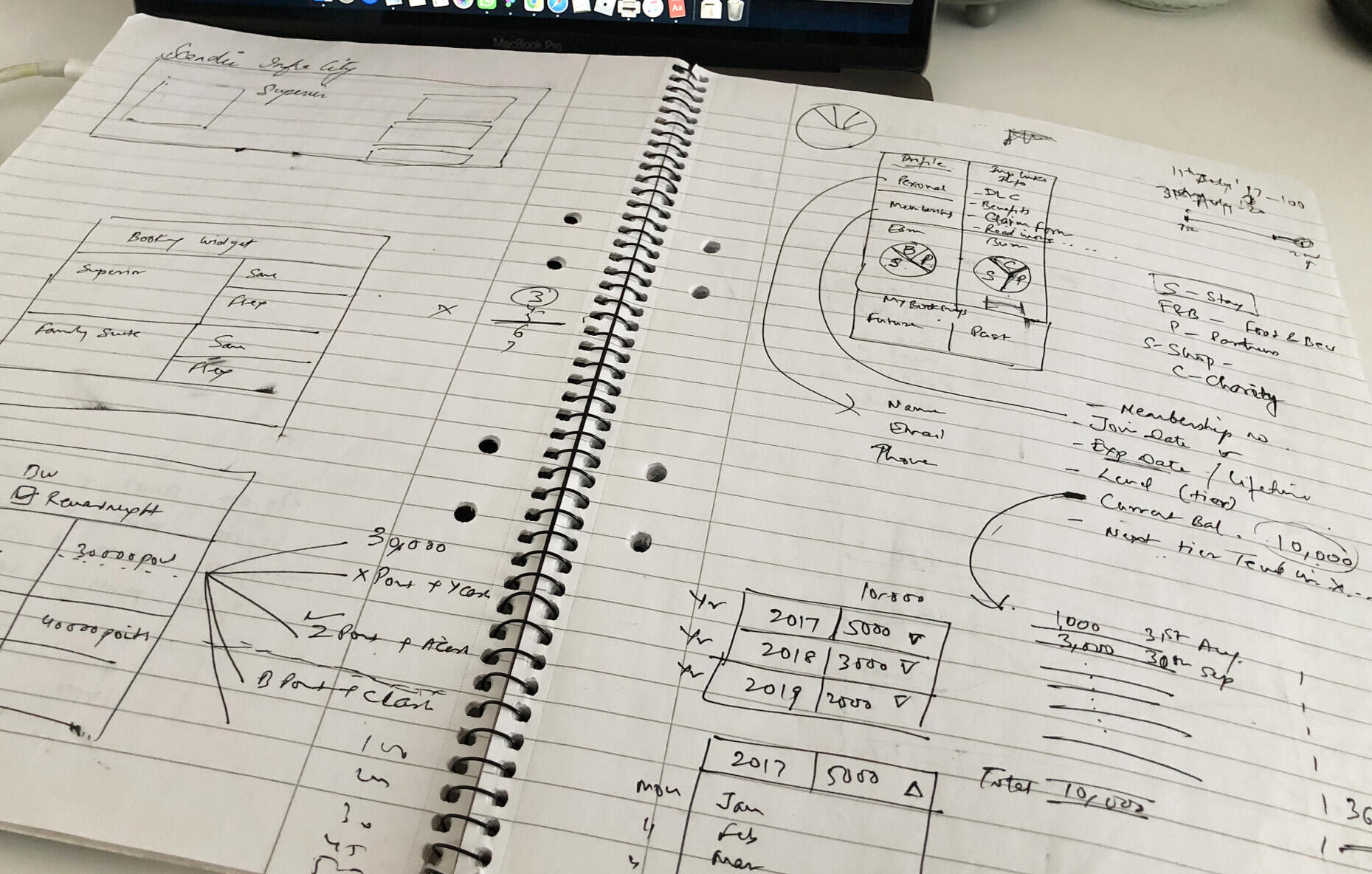
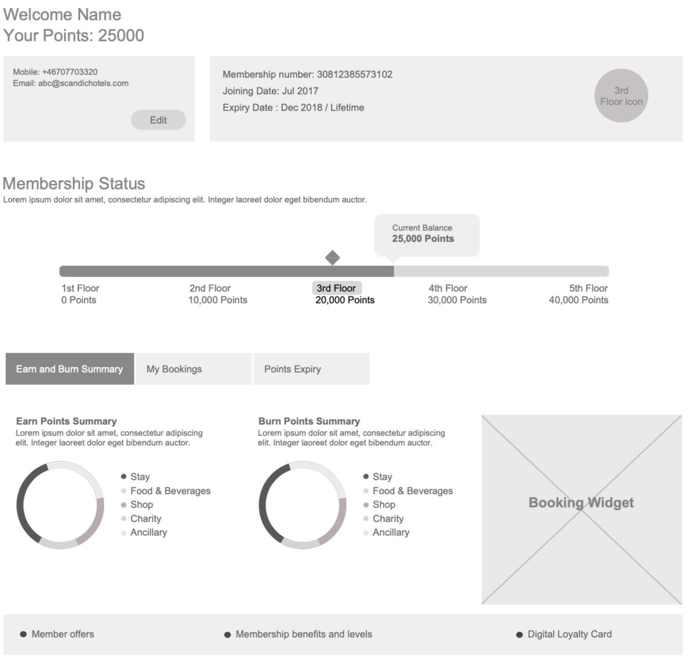
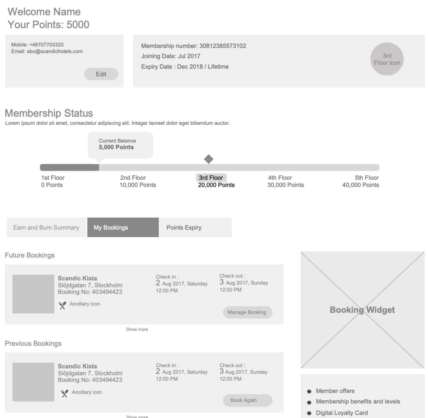
Scandic Hotels
Loyalty Program
This project was really interesting as it would be affecting millions of Scandic loyalty members and hence we had to focus a lot on quality and detail of information. Loyalty members were used to a certain program and this would mean a big change for them and we had to ensure it was a big positive change/experience.
Wireframes Paper Sketches
I did a lot of research on competitor and other successful loyalty programs before designing the journey and wireframes. We also had to adhere to Scandic's brand and design guidelines all along the way.
I was also part of lot of design workshops that involved lot of stakeholders across various departments within Scandic.
Wireframes
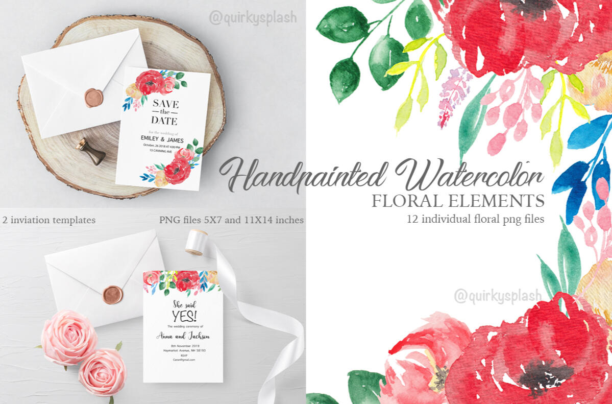
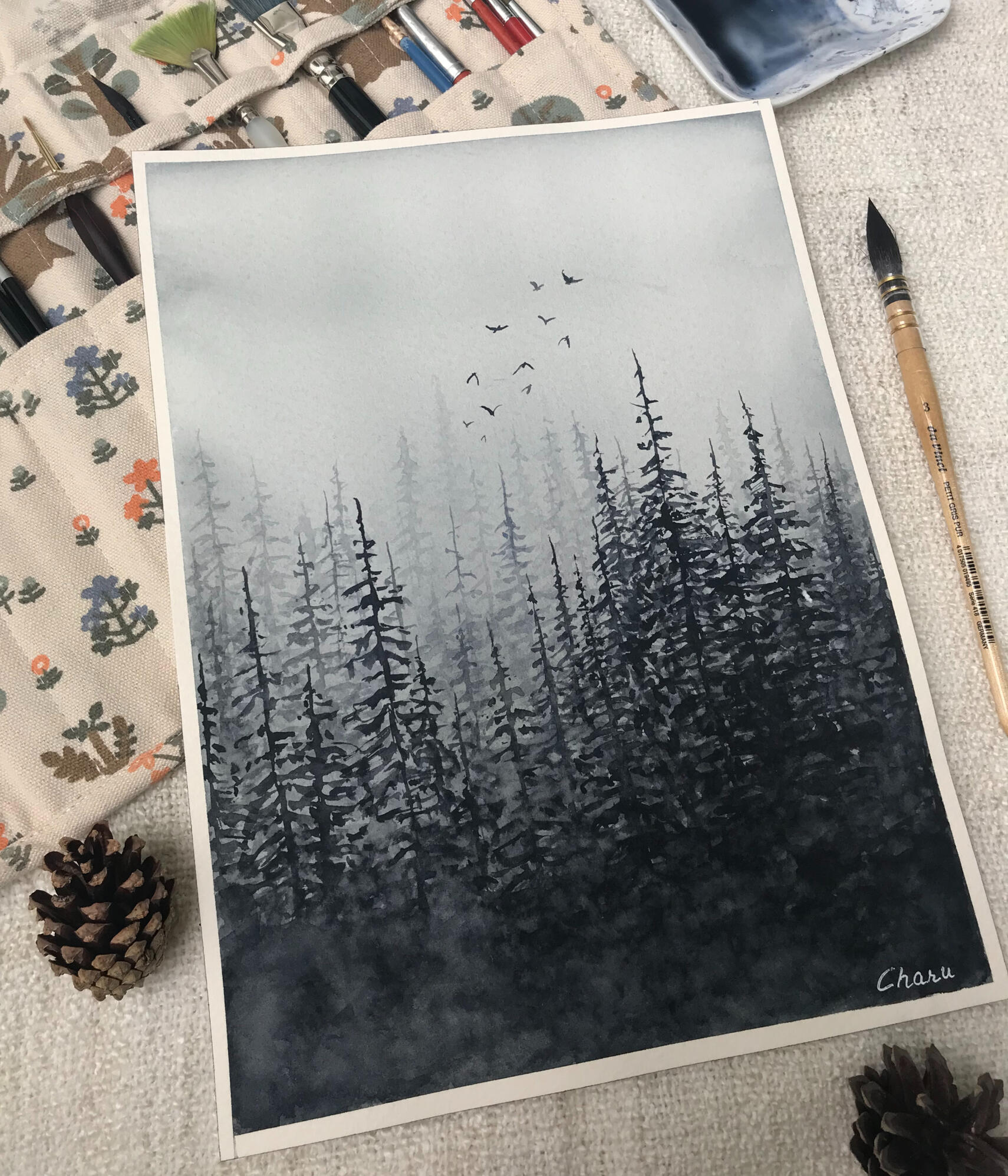
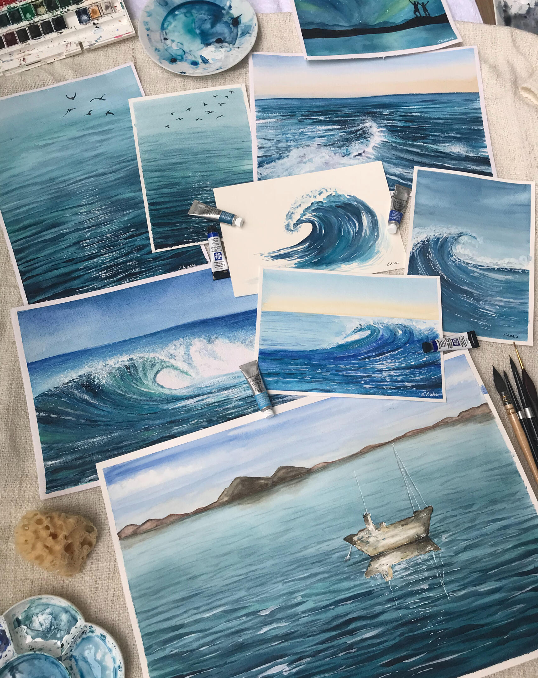
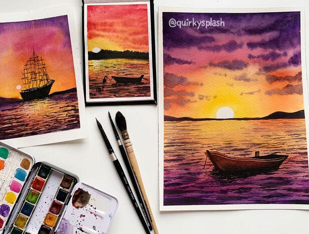
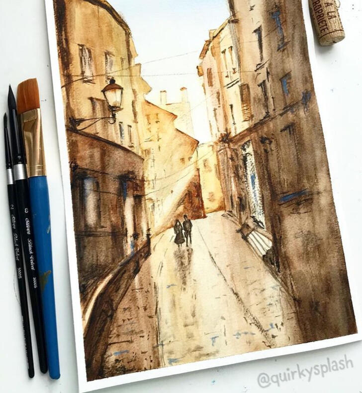
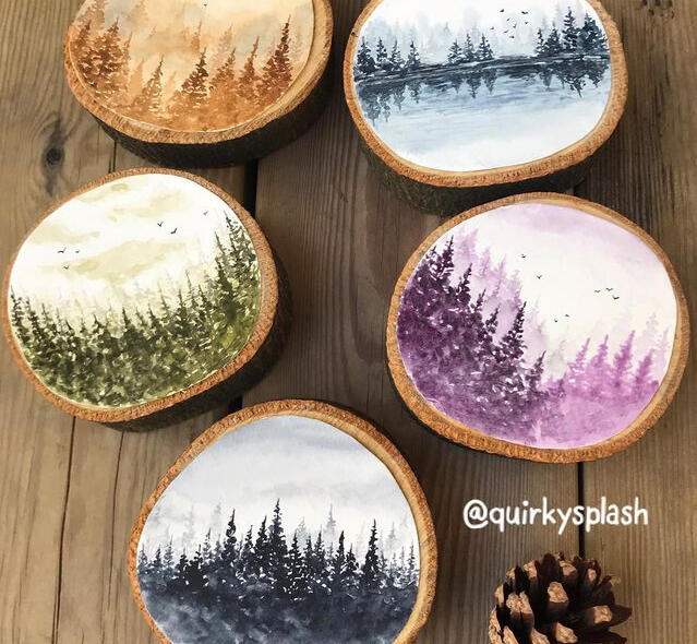
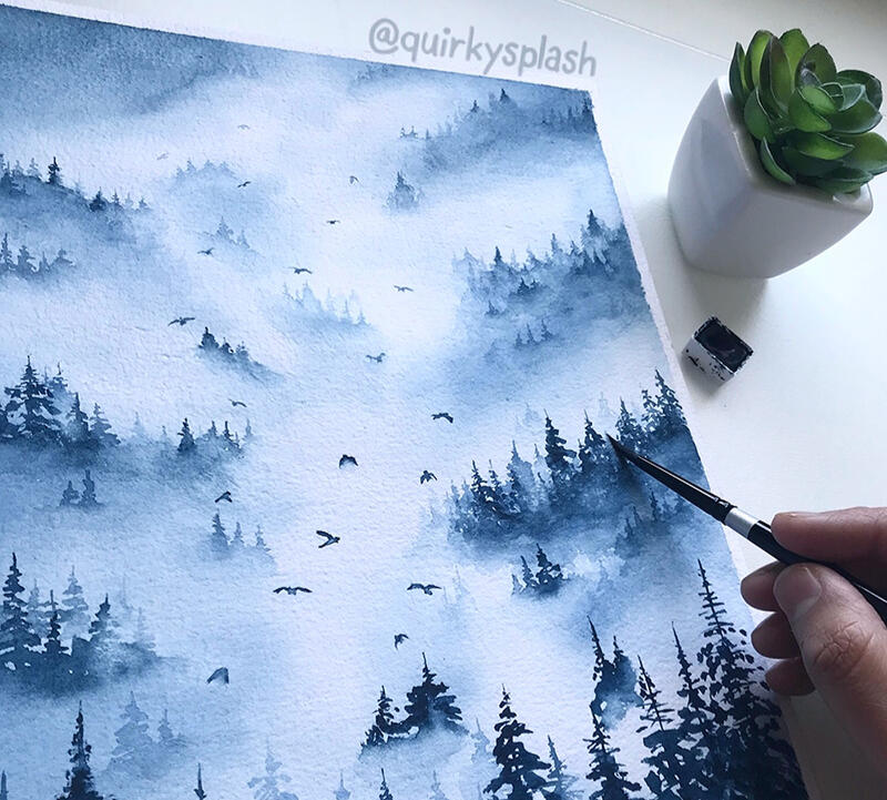
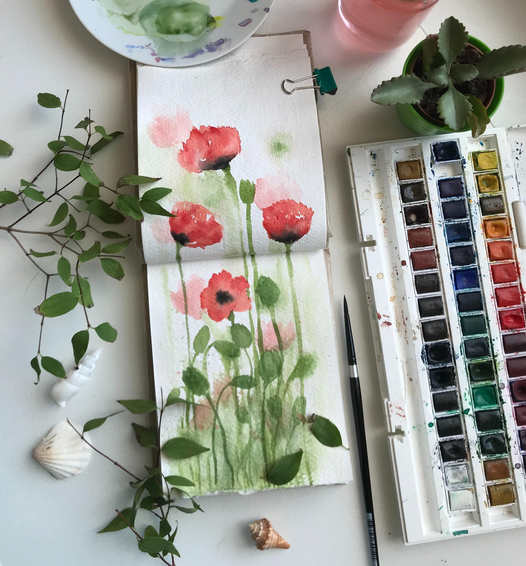
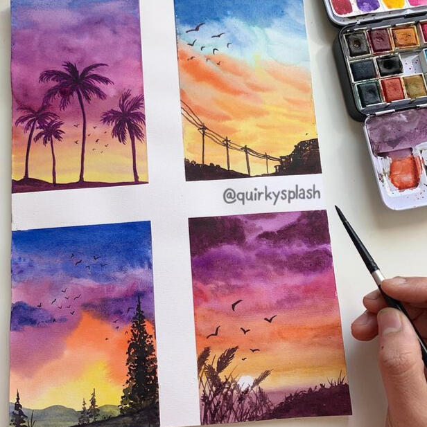
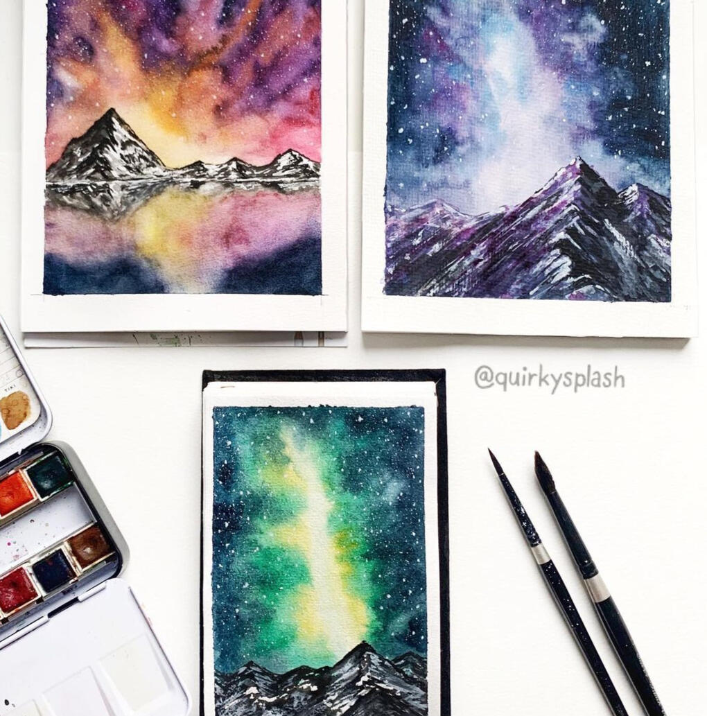
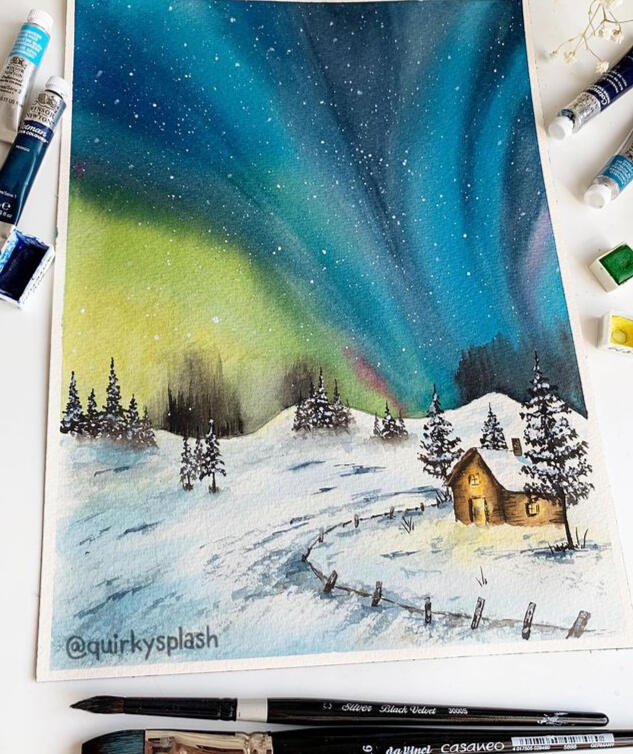
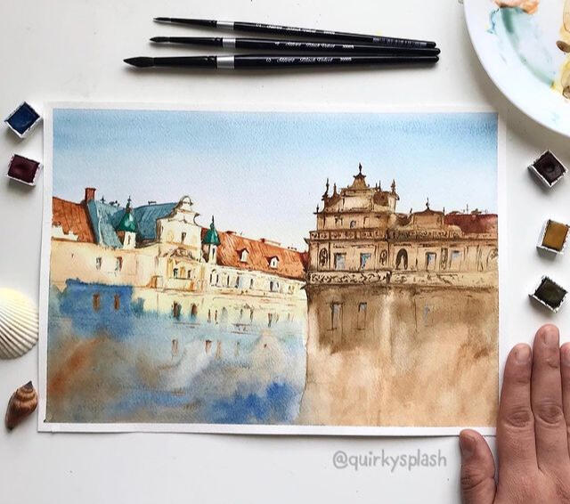
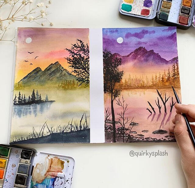
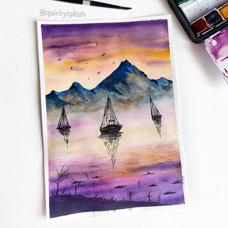
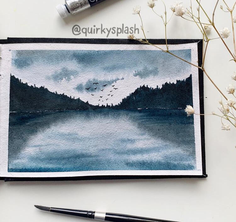
HANDPAINTED GRAPHIC ELEMENTS
WATERCOLOR
DIGITAL ART
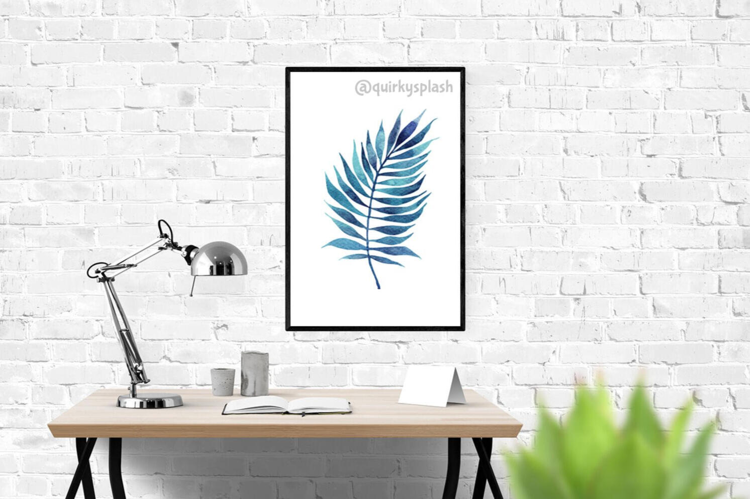
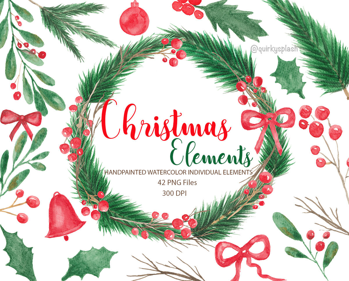
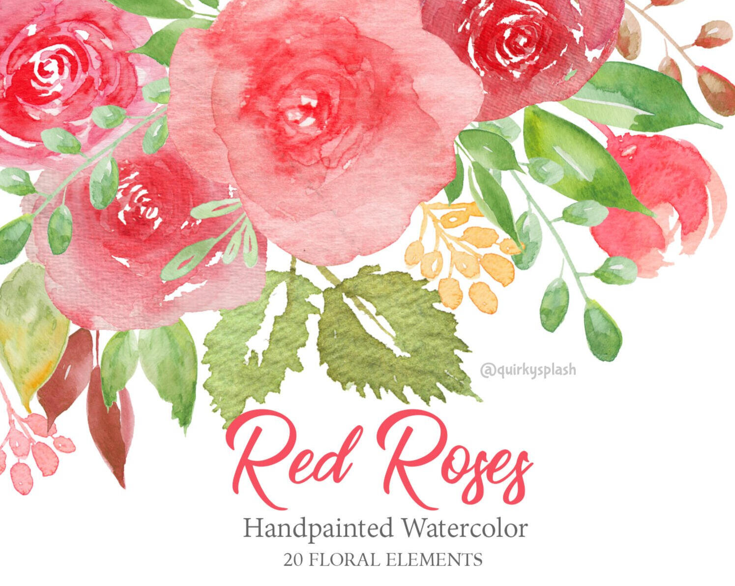
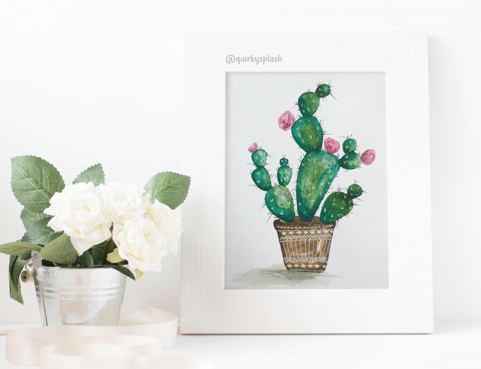
Traditional artwork
Watercolor paintings


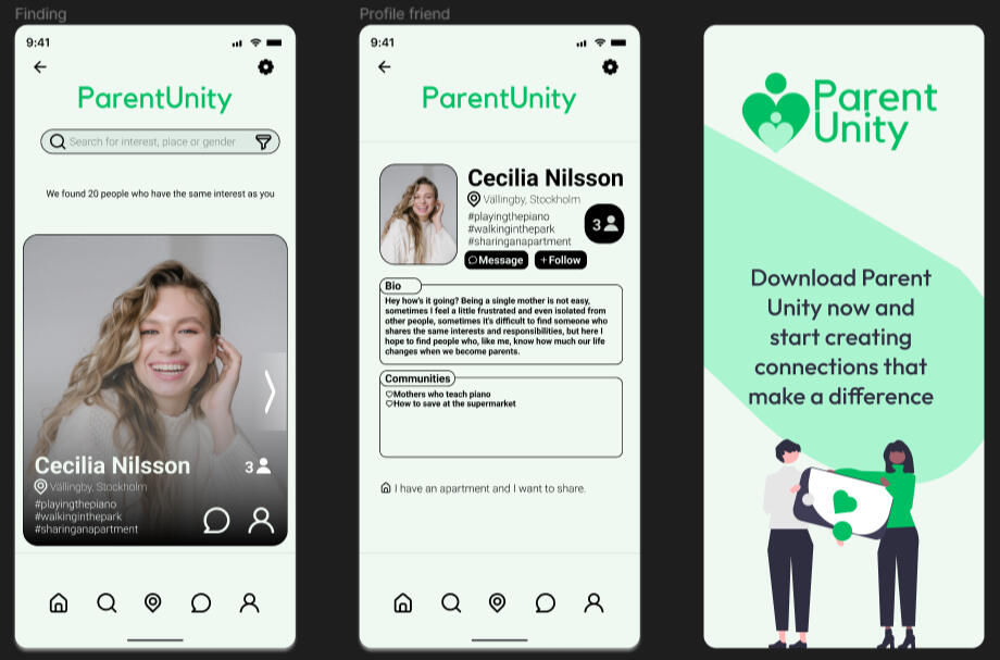
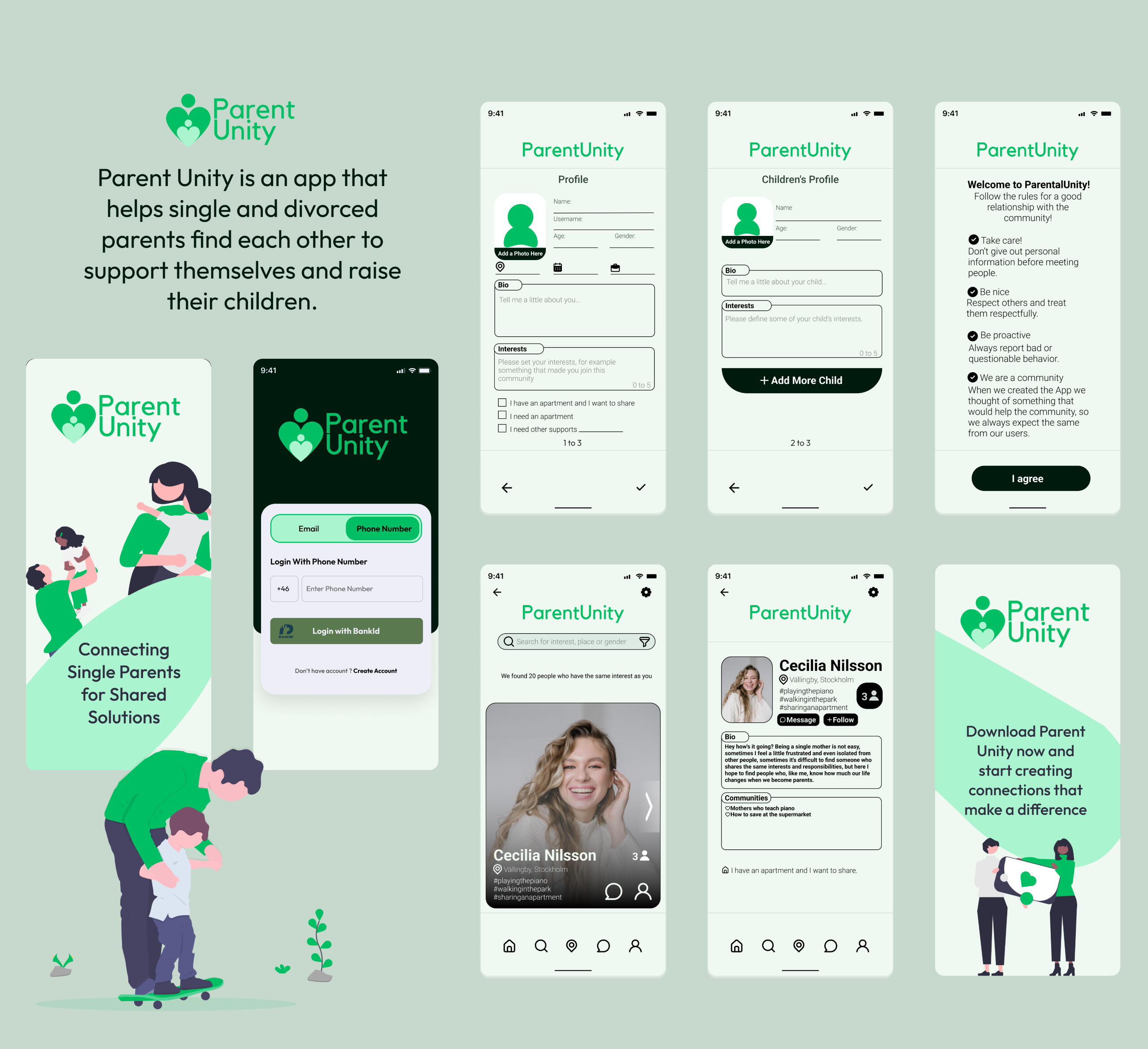
Parent Unity
Imagine a platform that brings together the resilience and strength of single parents, combining their unique experiences, talents, and needs. This platform isn't just about matching profiles, it's about creating a community where bonds are forged, burdens are shared, and opportunities are seized.Today, we introduce you to an innovative app that goes beyond traditional matchmaking, designed to enrich the lives of single parents in ways that are both practical and profound.
Our Story
Our app's journey began as a school project involving seven of us with diverse backgrounds. We aimed to create a platform that addressed challenges faced by single parents.Starting with a focus on shared housing, we expanded our scope to offer emotional support, childcare sharing, skill exchange, and more
Our Process
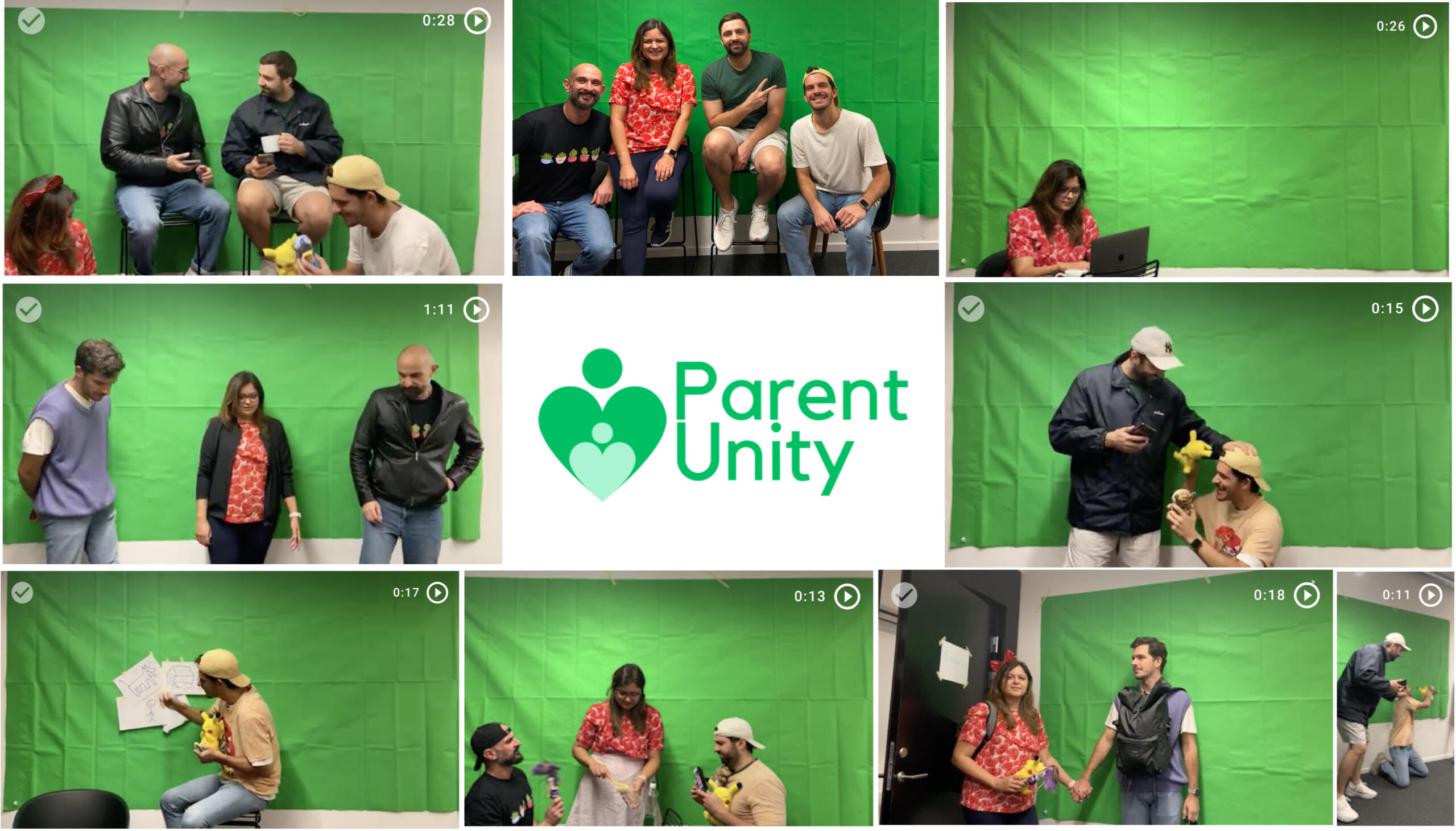
Our team has undertaken the development of a storytelling video to elucidate the challenges faced by single parents and present our innovative solution. This initiative involved the meticulous creation of a script, the careful definition and casting of characters, and the production of a video.The filming phase, conducted against a green screen backdrop, represents a significant milestone in translating our vision into a visual narrative. This method allows for flexibility in seamlessly integrating various settings and backgrounds, enhancing the visual appeal and storytelling capabilities of our video.
Our Services
CREATE YOUR PROFILE: Create a comprehensive profile that introduces you to the community. Provide essential information like your name, age, and location. Take a moment to craft a brief bio that shares a bit about yourself, your children, and your interests. This initial step helps you make a strong first impression and allows others to learn more about you.CUSTOMIZE YOUR PREFERENCES: Tailor your preferences to find the best possible matches. Indicate your parenting style, values, and expectations to ensure compatibility. Additionally, identify the type of support you're seeking – whether it's shared housing, childcare, or emotional support.ENGAGE AND CONNECT: It's time to engage with the community and start making connections. Browse through suggested profiles that match your criteria. You can use search filters to refine your options further. Initiate conversations with those who resonate with you the most. Use the messaging feature to chat, exchange stories, and explore common ground.
Features
* Childcare Sharing
* Emotional Support
* Transportation Sharing
* Skill Exchange
* Financial Assistance
* Networking for Employment
* Parenting Workshops and Classes
* Housing Assistance
* Legal and Financial Advice
* Resource Sharing
* Social Activities for Children
* Donation and Volunteering
Volvo Group
The Volvo Group provides products and services to the transportation industry. Their trucks, buses, engines, construction equipment and financial services are involved in many of the functions that most of us rely on every day, on the road, in the city, off-road, and at sea. They employ around 100,000 people, have production facilities in 19 countries, spend ~20 BSEK in R&D yearly and sell their products in more than 190 markets.
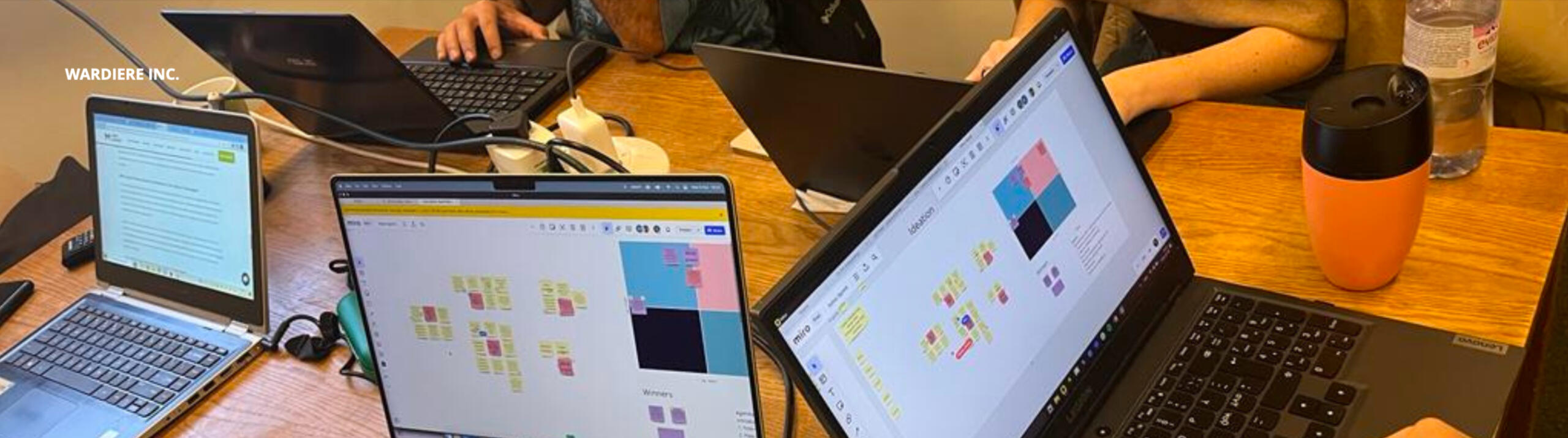
Hack-sprint
We got an opportunity to work on a 3 day hack-sprint for Volvo Group to address a very common problem of climate change which is a reality now. We were divided into many teams with 4-5 members in each team.
Companies are looking to decarbonize to meet carbon neutrality goals. More than 200 companies have joined the pledge to reach net-zero within the next two decades. The Volvo Group is one of them. The transport and logistics sector takes a pivotal role in carbon footprint reduction. Transport contributes 13% of the GHG emissions globally, and goods transport contributes to more than 50% of the total transport GHG emissions. Therefore, it is of a natural mission of Volvo to help in accelerating societies towards carbon neutral.
Problem Statement
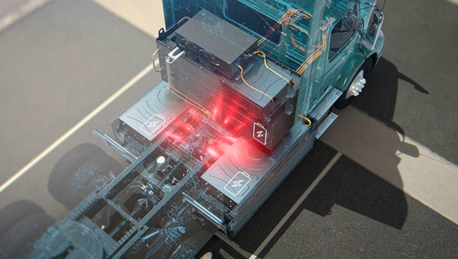
Our customers has for decades been working with diesel powered construction equipment for their worksites and are well skilled in how to setup and operate sites based on this type of equipment and technologies.
Following the desire to become carbon neutral and have zero emission worksites most construction equipment will move to electricity as their main power source.
Whilst our customers want to transform their sites to electricity, they face several challenges as they many times lack both the skills needed and the understanding what needs to be done as well as the confidence to take on such a large transformation. Some customers think the risks are to high, therefore unwilling to take the step. Here Volvo CE want to contribute to society at large and help the customers in their transition towards a more sustainable quarry, where the operations in a multi brand quarry will work over a longer period of time. We are looking for the next generation services and solutions to manage and reduce carbon footprint in goods transportation.
The industry segment we target for this activity is Quarries & Aggregates.
Objectives, Requirements & Deliverables
What services do we need to provide to our customers to support them on the transformation journey to electric worksites? How would such services be offered to show the added value it provides for Volvo CE’s customer in the long run?Each team should come up with at least three distinct results:
1. The value proposition: what are we offering to whom? Describe why the solution is desirable from a customer perspective.
2. What could be the possible revenue streams?
3. How feasible is a technical implementation, and the needed organizational structure, to produce, sell, deliver, and support the solution?
Our Proposed Solution
Easing industry concerns over usage of AI in predictive maintenanceObjective
To introduce the usage of AI in predictive maintenance and ease it in through a collaborative workshop. To facilitate knowledge sharing among companies, empowering them to embrace environmentally friendly practices and alleviate concerns related to quarry operations.Strategy
Establish a collaborative platform where Volvo shares advanced eco-friendly expertise, fostering a community-driven exchange of sustainable strategies and insights. It will focus on sharing knowledge of AI benefits and the new technology that will predict maintenance, enhancing safety and lowering future costs.
This campaign aims to unite industries, offering a forum for shared learning, thus driving a collective movement towards a greener, more responsible business landscape.
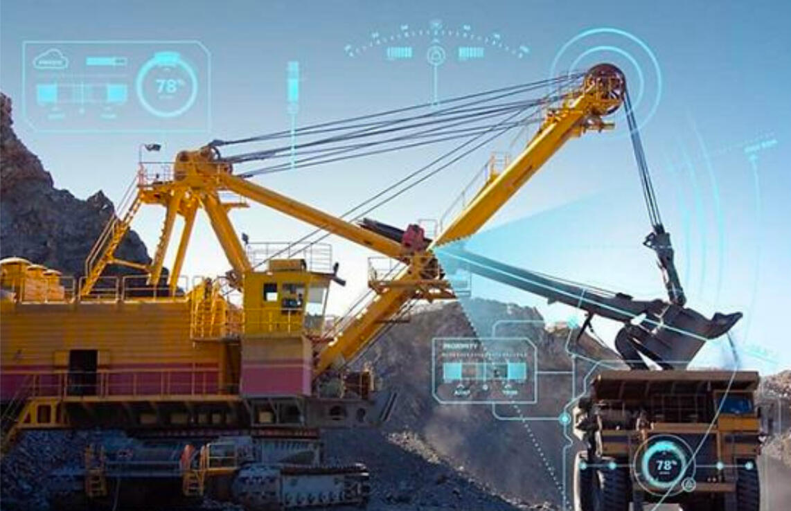
AI Predictable Maintenance
A control tower, or a centralised monitoring system, can be highly beneficial in managing and optimizing the operation of heavy-duty machinery on site. Such a system can effciently coordinate and control various aspects of quarry operation.It can manage:
1. Charging schedule
2. Priority management
3. Workflow coordination
4. Fault detection
5. ReportingWhy use AI to predict maintenance?
1. Maximise safety
2. Decrease costs of fixing major issues that escalated after going un-noticed
3. Increased efficiency, reduced production stops & disruptions
4. Quality control
5. Sustainability
Our Process
The Team
We kicked off our project by examining the brief and conducting an internal team debrief. It was unanimously agreed to follow the double diamond approach. We then dived into individual research, held team discussions, and transitioned to the ideation phase. Through a thorough assessment of concepts for their value and impact, we arrived at our final concept.
Implementation
The implementation step program will target the anxieties of customer companies and the employees. Workshops shall take place targeting concerns and providing support.Why workshops?
1. A pleasant, non stressful environment
2. Easy way to share knowledge and training
3. Team building activities to unite workers together and bring a sense of communityWhy we believe it is doable?
1. Volvo has been working on implementing AI for a while, so it is not a brand new concept
2. AI is quickly expanding to all spheres of life and business, so this is just a matter of time
1000 Ocean startups
Designing for brand and business value
Our client, 1000 Ocean Startups, represents a collaborative alliance focused on accelerating ocean innovation by uniting various organizations. They operate as a central nexus, bridging the gap between startups and prospective investors.They tasked us with the challenge of enhancing their existing platforms, making them more prominent among their members and competitors. Their goal was to firmly establish themselves as one of the foremost leaders in the ocean-based sector.
PROCESS & planning
After our first meeting with the client, they clearly asked us to create ‘Brand Audit Report’ for a complete check of their brand design as a first deliverable.During our discussions, we laid a plan of two deliverables. They were open to various final presentation options, leaving the decision to us. We decided to share the initial audit at the midpoint because we considered it both attainable and valuable, providing the client with substantial information early on.This approach allowed us to provide the client with valuable insights and progress updates while keeping the flexibility to refine our final presentation format based on the evolving needs and priorities
Research & Insights
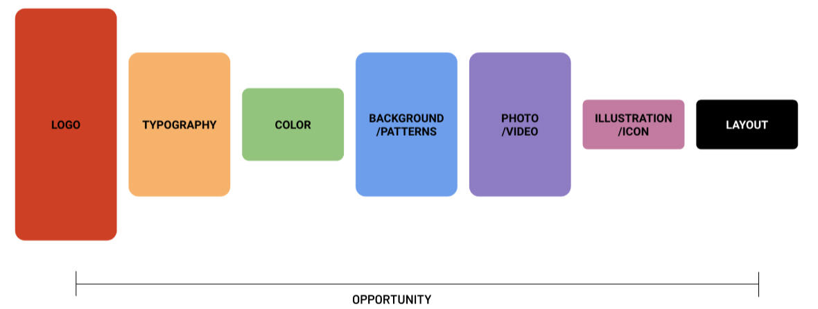
Our team divided the tasks and started investigating into 1000 Ocean Startups, its member organizations, and additional ocean-related groups. We delved into their websites, scrutinised their social media presence, and analysed their newsletters.After doing research and competitive analysis we compiled our findings in which we created a comprehensive examination and assessment of the company's brand and its various components to gain a clear understanding of its current standing, strengths, weaknesses, and opportunities for improvement. Here are some key aspects typically we included in the brand audit as shown in the image.Additionally, we created personalized stylescapes that were to be shown to the client.

The Next step: deciding our final delivery
Our research for the Design Audit revealed a significant issue – the brand exhibited a high degree of inconsistency in its use of elements such as logos, colors, and imagery. This inconsistency could potentially dilute the brand's identity and message, creating confusion among its audience.Our team made a decision and we determined that the most effective solution was to develop comprehensive Brand Guidelines. These guidelines would serve as a vital resource, offering clear and detailed instructions on how to use and apply the brand's various elements consistently across all platforms and materials.
But we took a u turn and delivered.....
However, following a thorough assessment of feedback from our industry mentor, Oliver from Söderhavet, who emphasised the importance of aligning with our client's values we decided to shift the focus of our final deliverable.He pointed out that brand guidelines, while important, might not directly address the core issue at this stage. We considered the question: Would creating brand guidelines resolve the underlying problem?
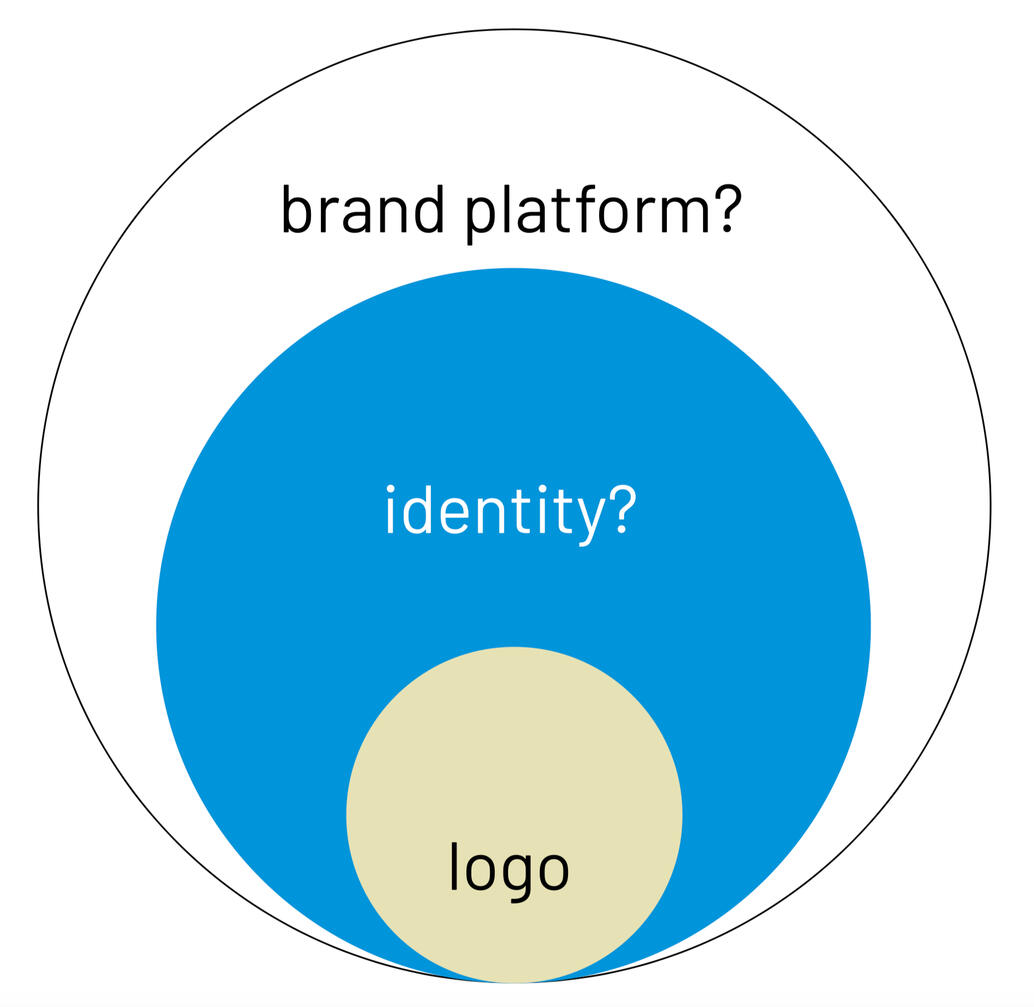
Ultimately, we concluded that our client's primary need was not just brand guidelines but a well-defined Brand Concept. We recognised and took a U turn that a cohesive brand concept would be the driving force behind consistency and clarity in their identity. This shift in approach would provide greater value to our client. As a result, we delivered a Brand Concept, prioritizing their foundational brand identity before proceeding with detailed guidelines.
Deliverables
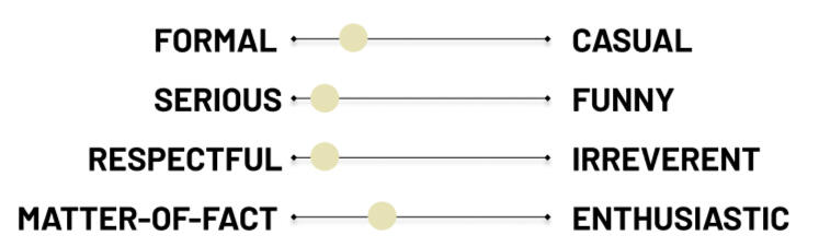
Tone of voice: We provided them with examples of how to adjust their tone of voice to suit various audiences.
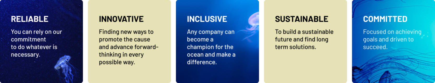
Core Values: We crafted the fundamental principles and values that serve as the bedrock of the company's identity and guiding philosophy. These core values are the fundamental beliefs and ideals that underpin the organization's culture, decision-making processes, and actions.
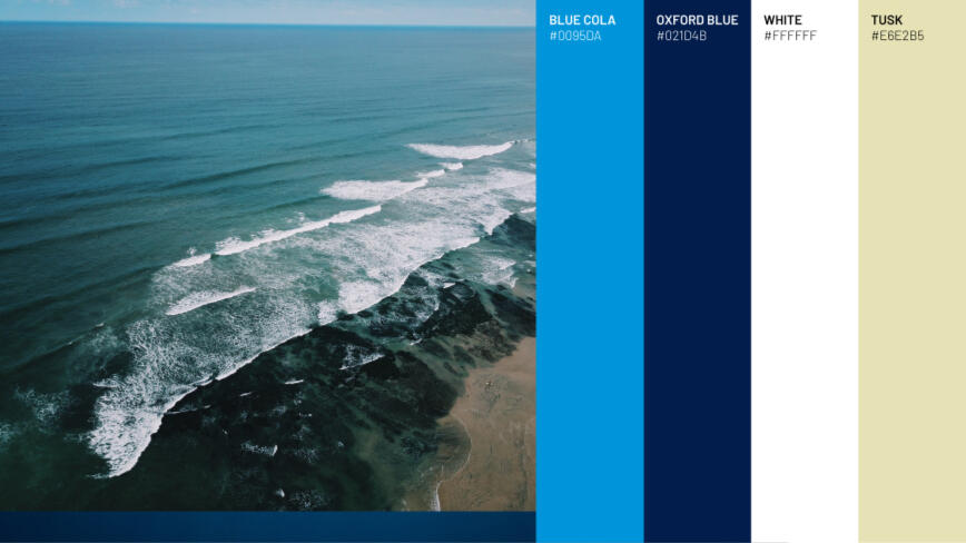
Colors: We simplified and improved their colour scheme to make it more useful. After careful consideration, we settled on three main colors and added an accent color which was not present before.
Mockups: Through many mockups, we helped them by demonstrating how to use their pictures, logo and text. This can be utilised for numerous occasions and events.
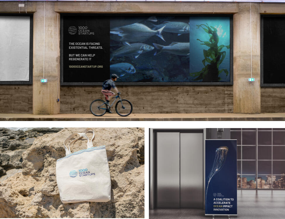
Assets: We used their logo to create wave patterns and a bubble circle for presentations and platforms, adding more design elements.
This approach aimed to reinforce the brand identity and create a more cohesive and engaging user experience across various mediums.

Reflection
This project has provided me with a deep well of insights into the multifaceted world of branding. One of the most crucial lessons I've learned is the the importance of having a well-defined brand concept. It's the very foundation upon which the entire branding structure rests.It's been a journey marked by learning and growth, both on a personal and professional level.
The experiences I've gained during this project have been incredibly valuable. I've learned about effective teamwork, problem-solving, and the intricate details of branding and design. I am grateful for my team and the project which has provided me with an opportunity for real-world application of my skills, and it has been an enriching experience that I will carry with me into future endeavour's.